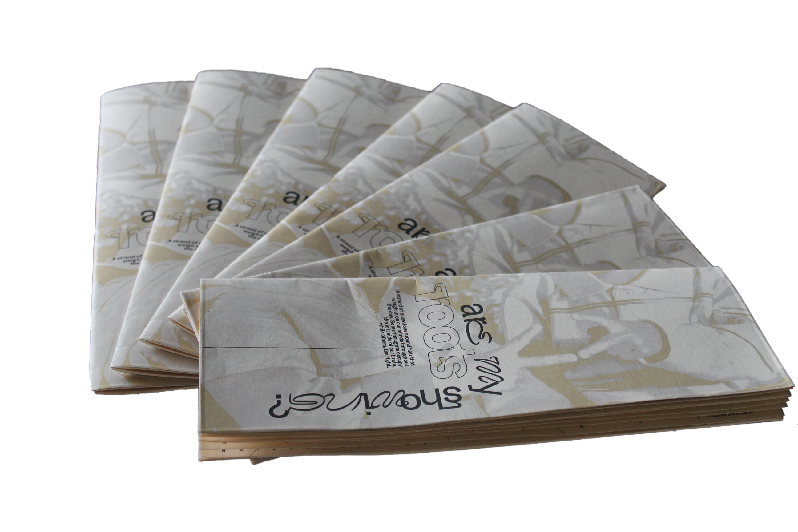
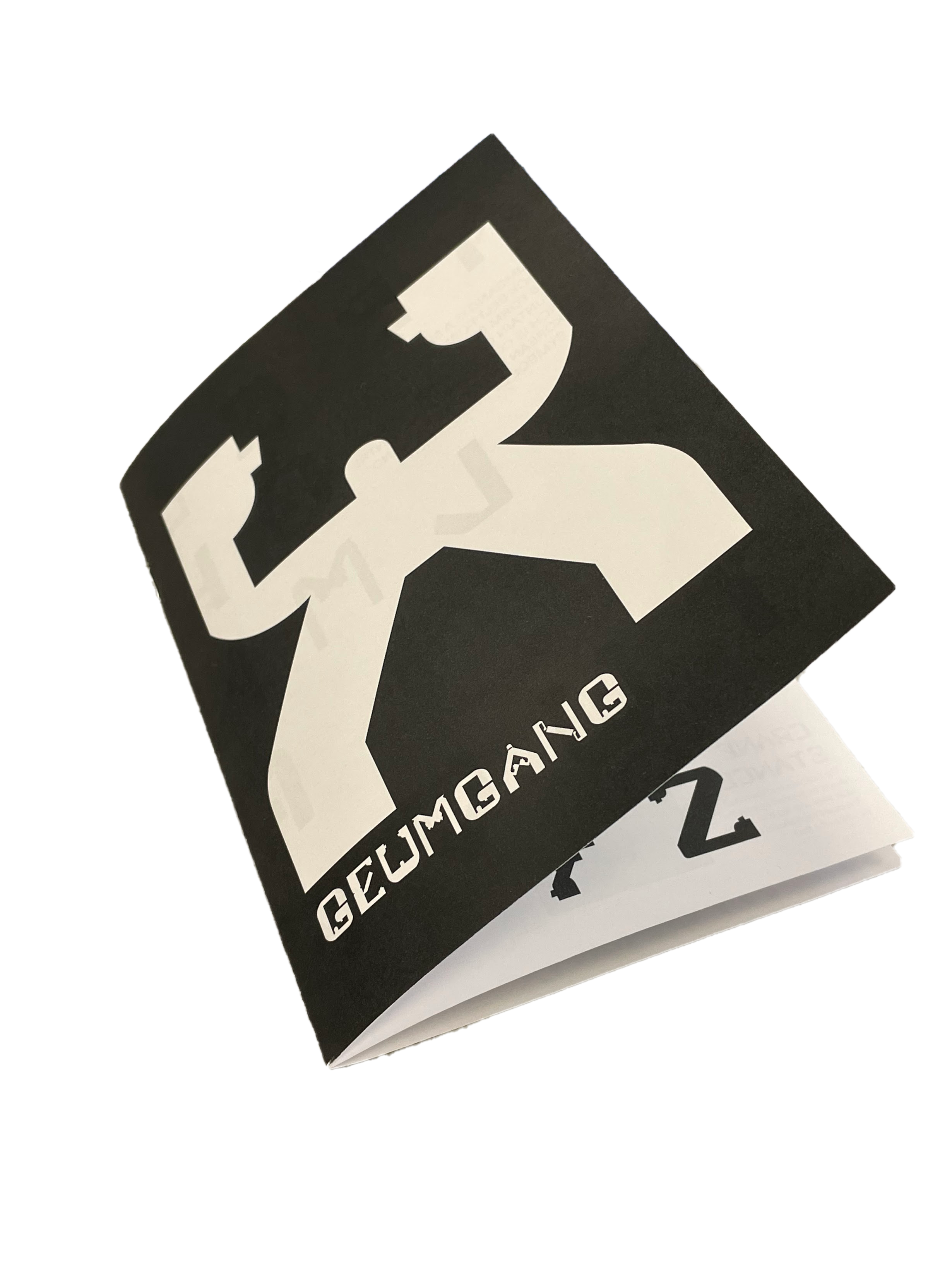
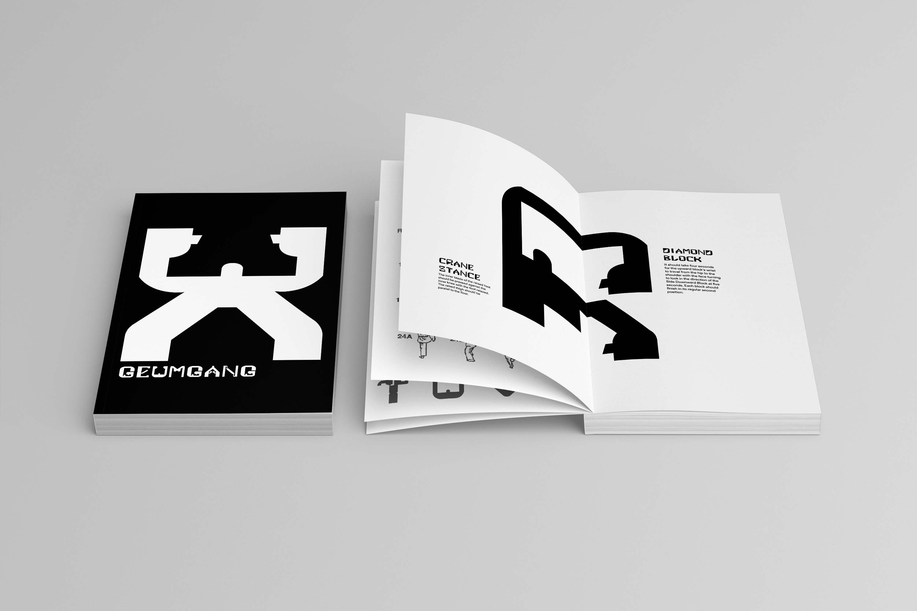
Geumgang Typeface
NOV 2021 - DEC 2021 ︎ Typeface Specimen
[Skills] Typography, Publication Design
[Tools] Robofont, Illustrator, Indesign
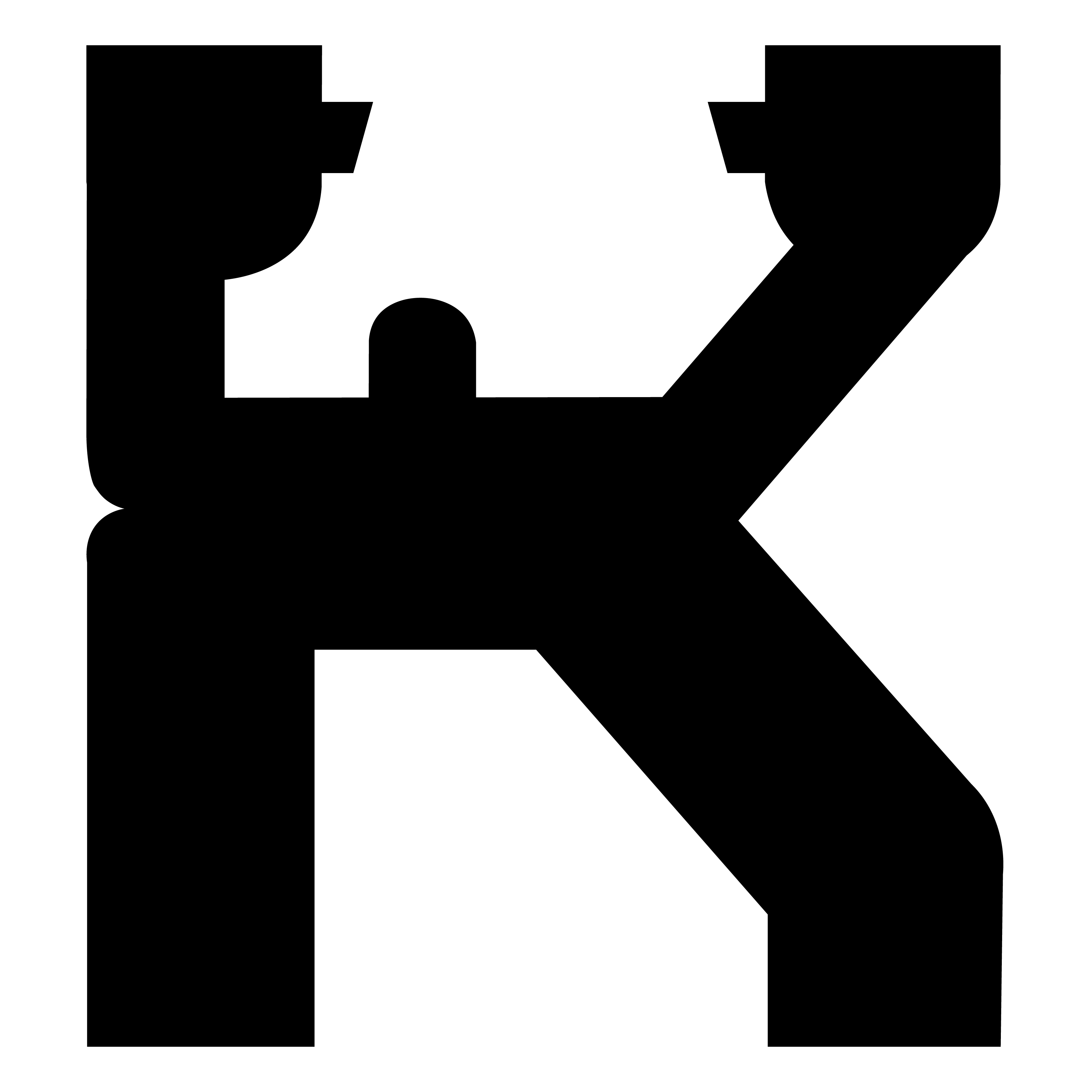
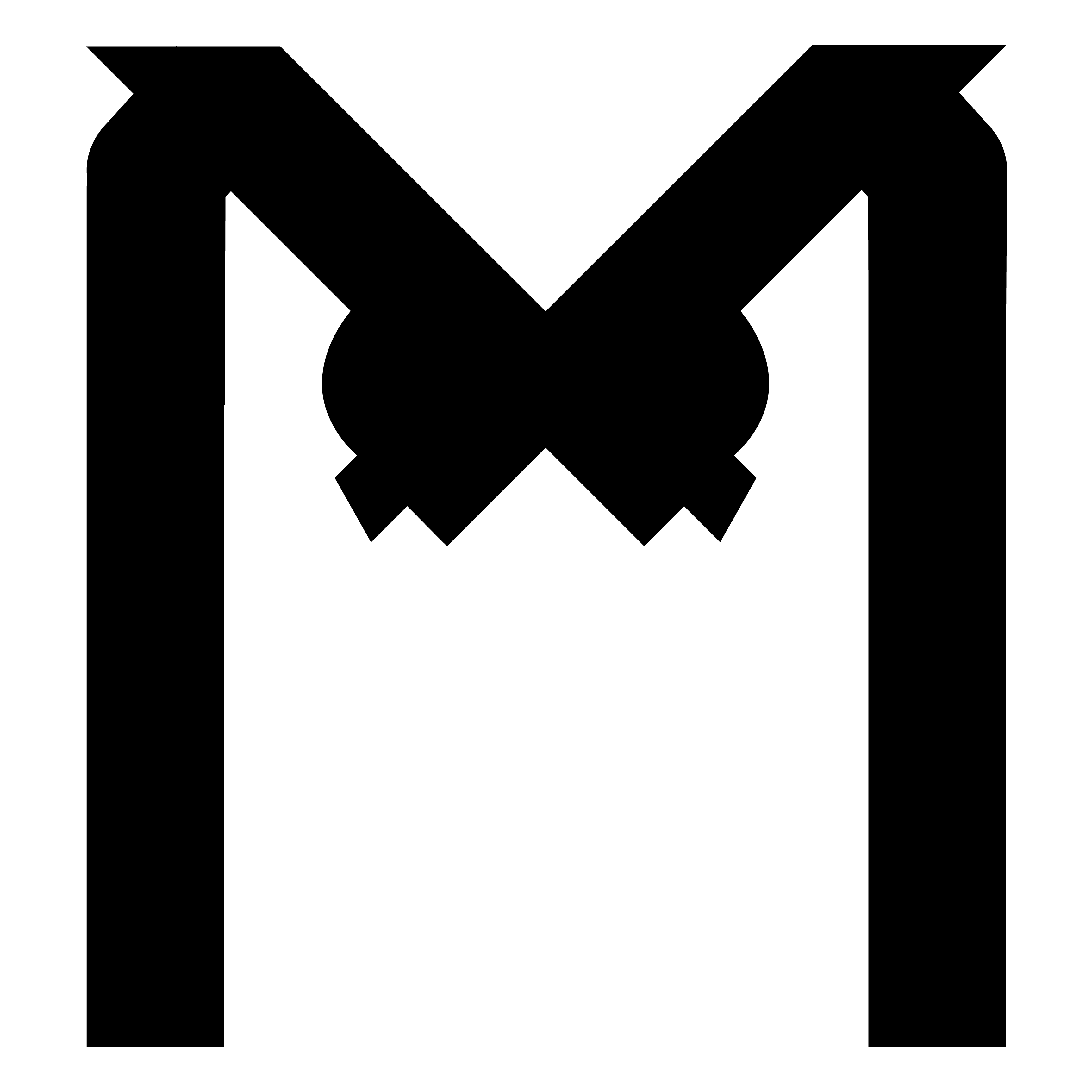
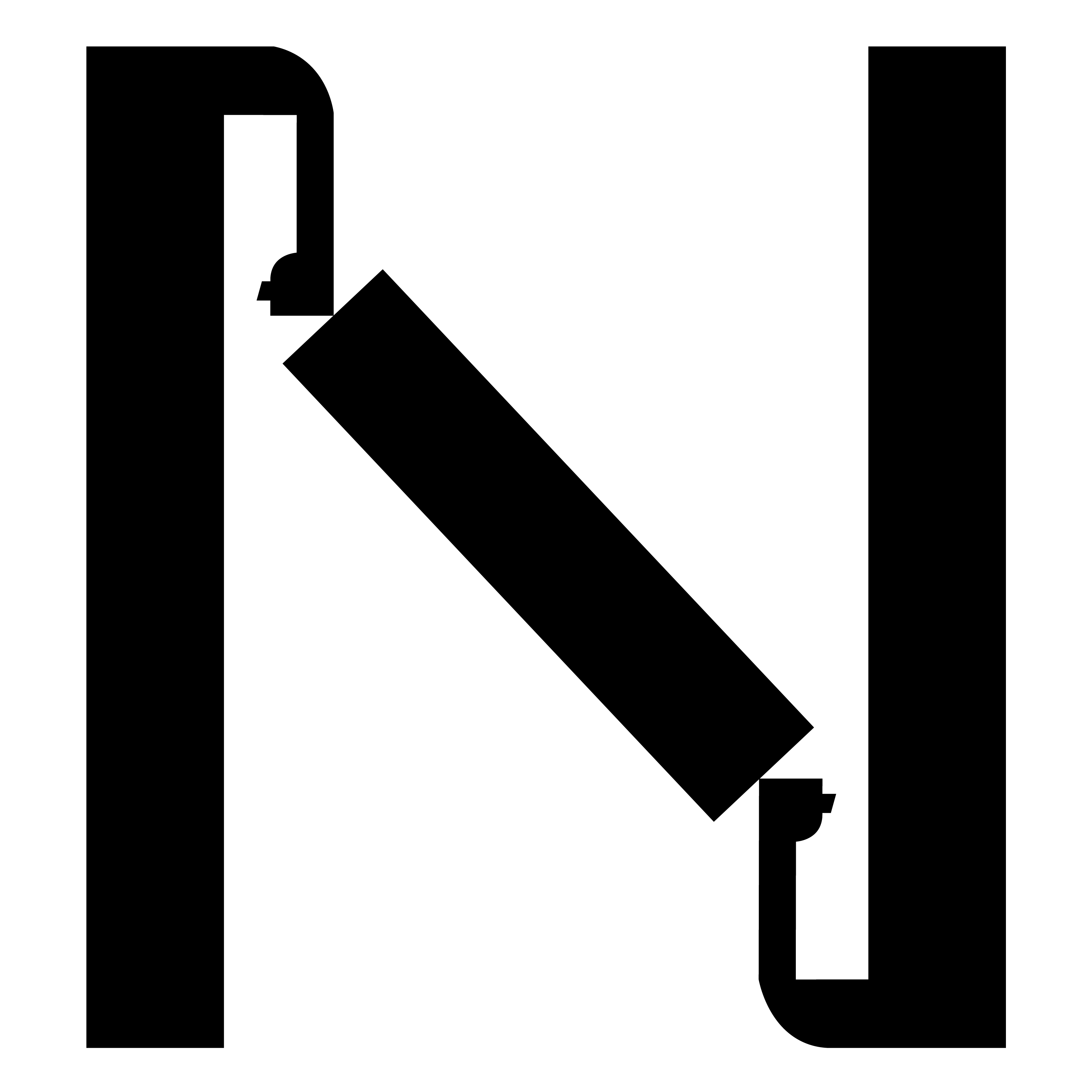
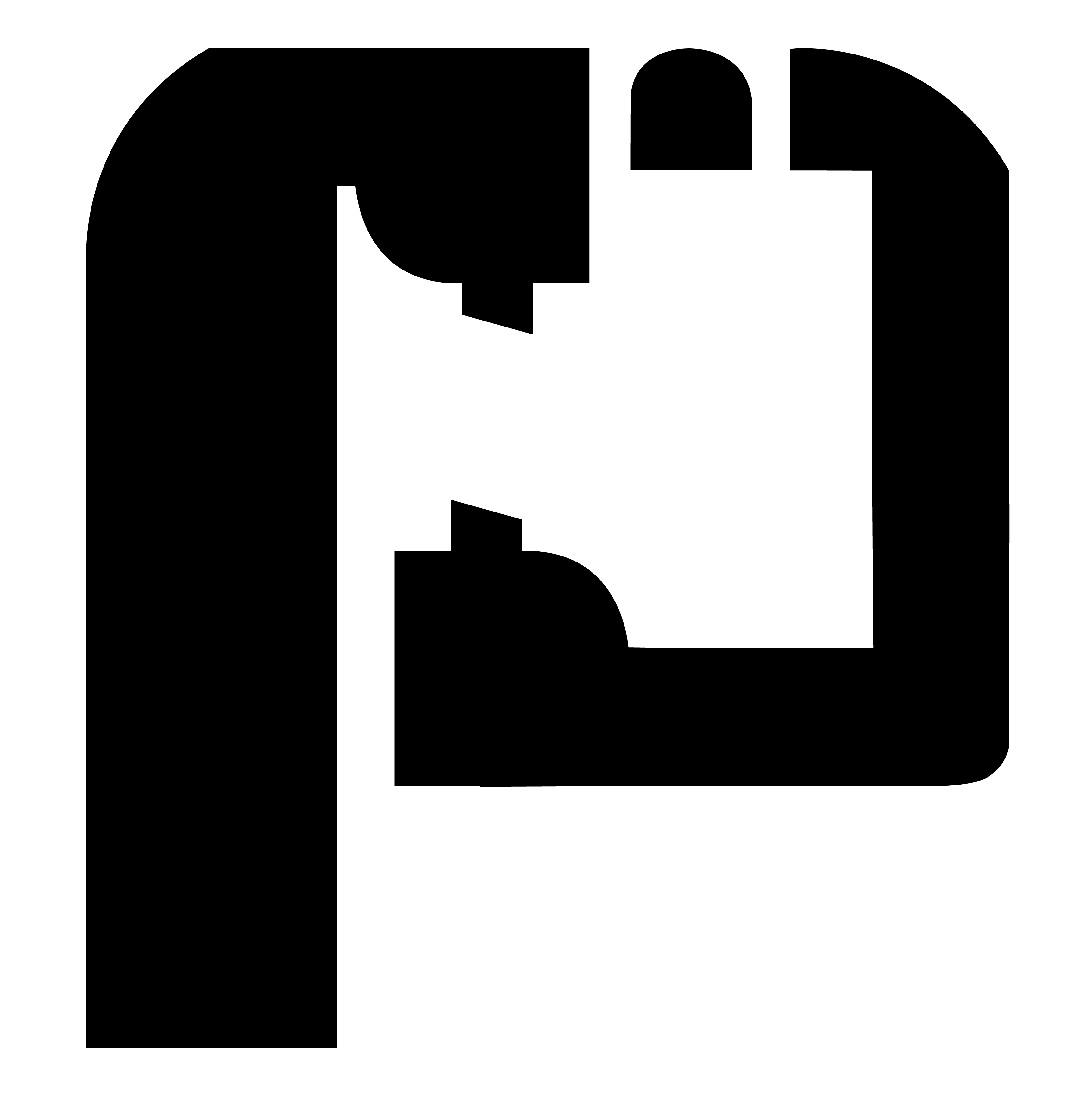
Inspired by the second-degree black belt form in Taekwondo, this typeface specimen demonstrates the elegant strength behind Korean martial arts.
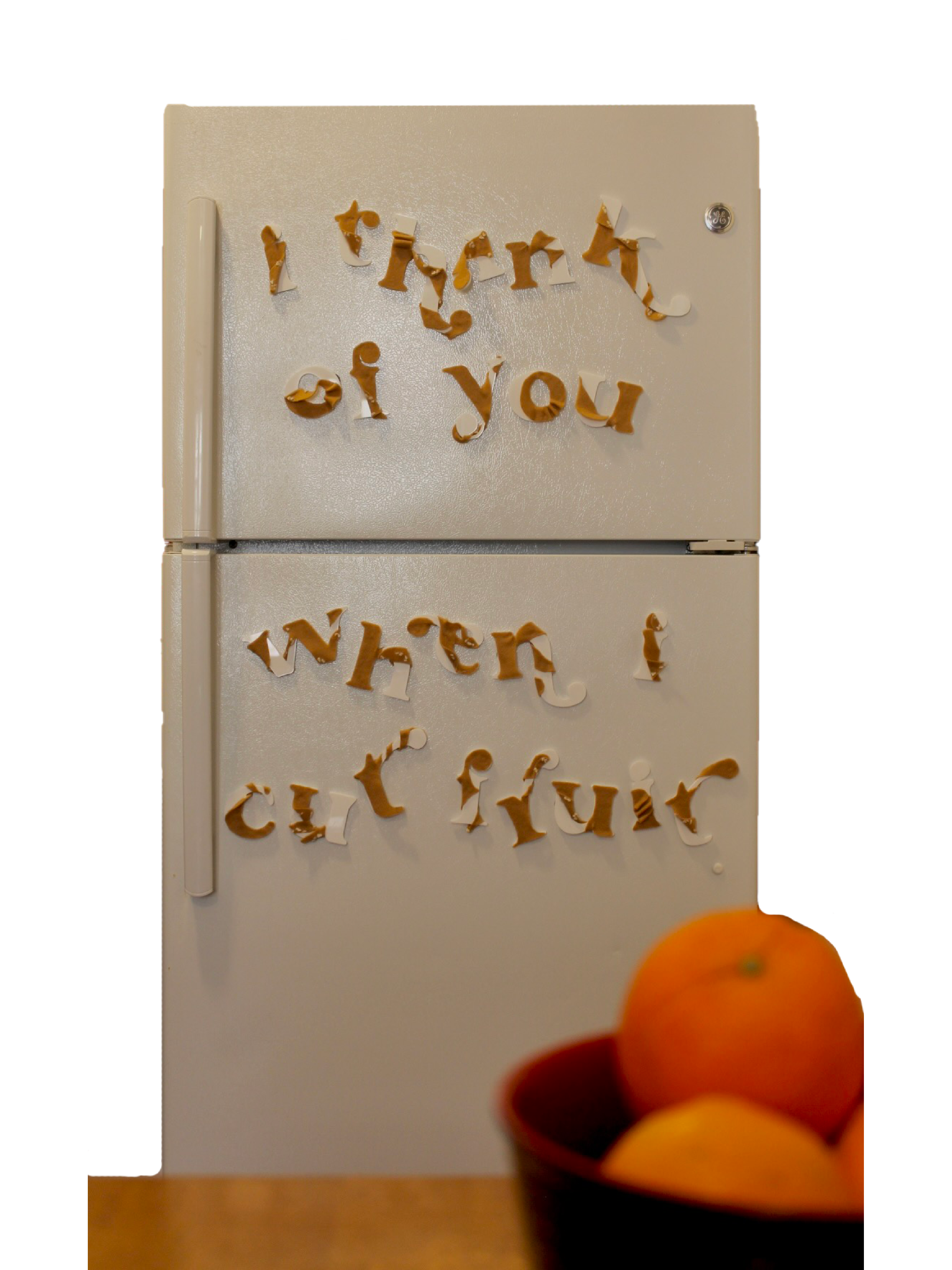
This was my first opportunity to design a display typeface, so I was determined to apply as much playfulness in the design while being able to make it feel like a cohesive set of letterforms. Since my early childhood, I practiced Taekwondo and gained confidence by mastering the different poomsaes [forms] of each belt level. I did not want to stop practicing this discipline when the pandemic closed down my studio, so I reconnected with Taekwondo through this project.
The current typefaces printed on sparring event posters or in vinyl on the windows of studios feel outdated and stereotypical of a martial arts form. Therefore I aimed to create a typeface that feels unique and modern to the gestures practiced in Taekwondo poomsaes.
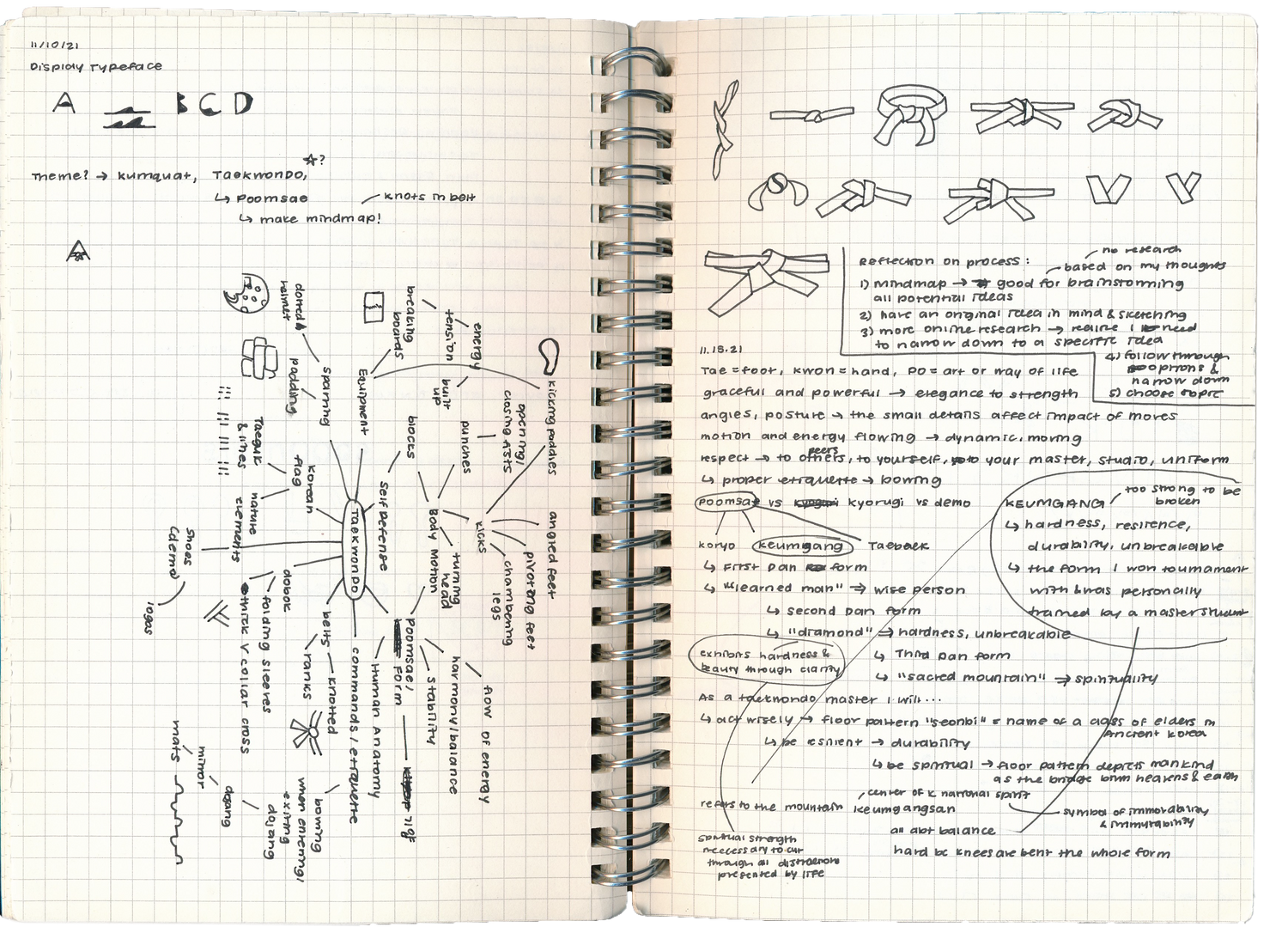
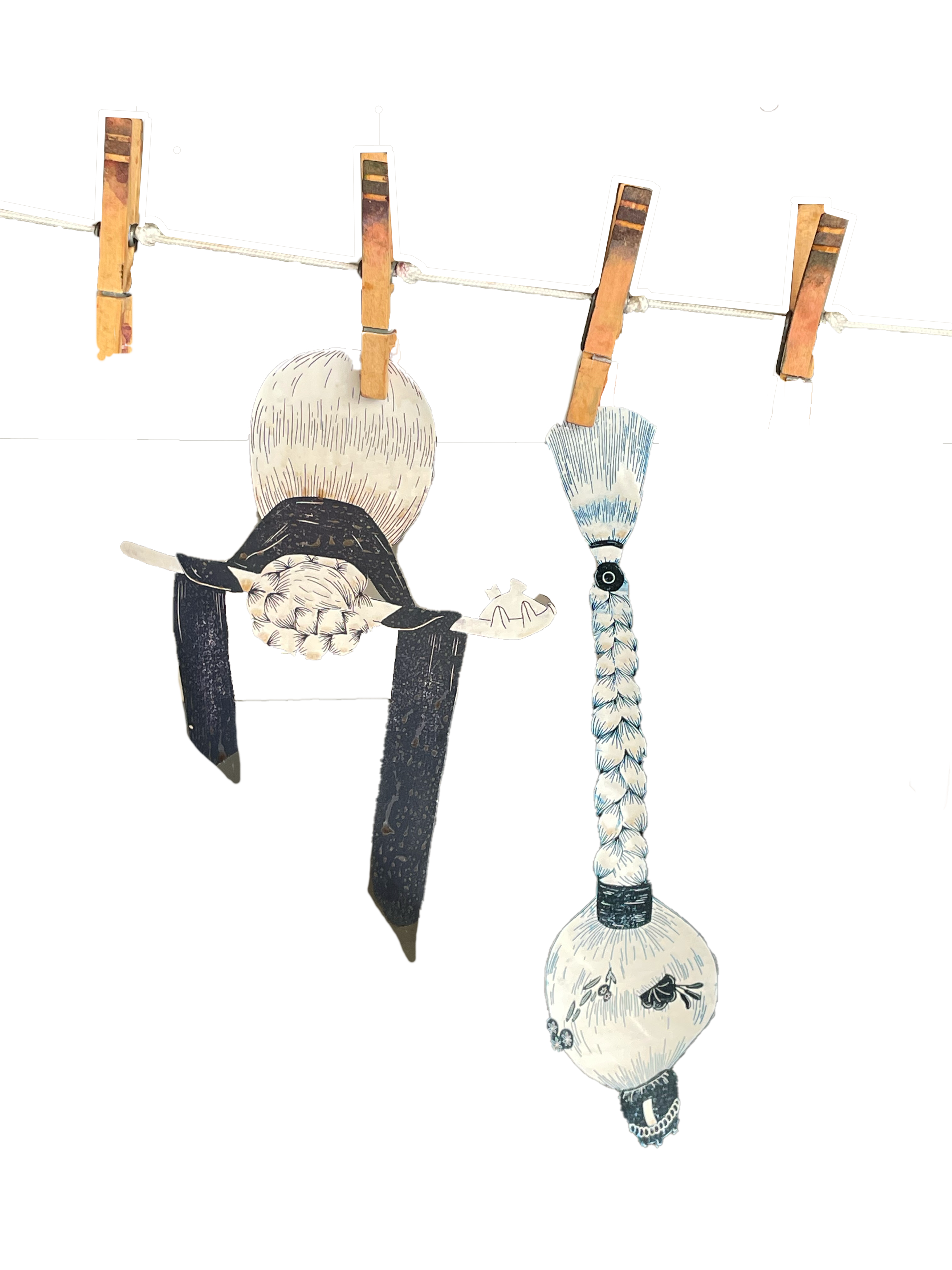
My process usually begins with sketching a mindmap around a central word, this being “Taekwondo.” I explored sketches with the way you tie your belt as part of your Taekwondo uniform.
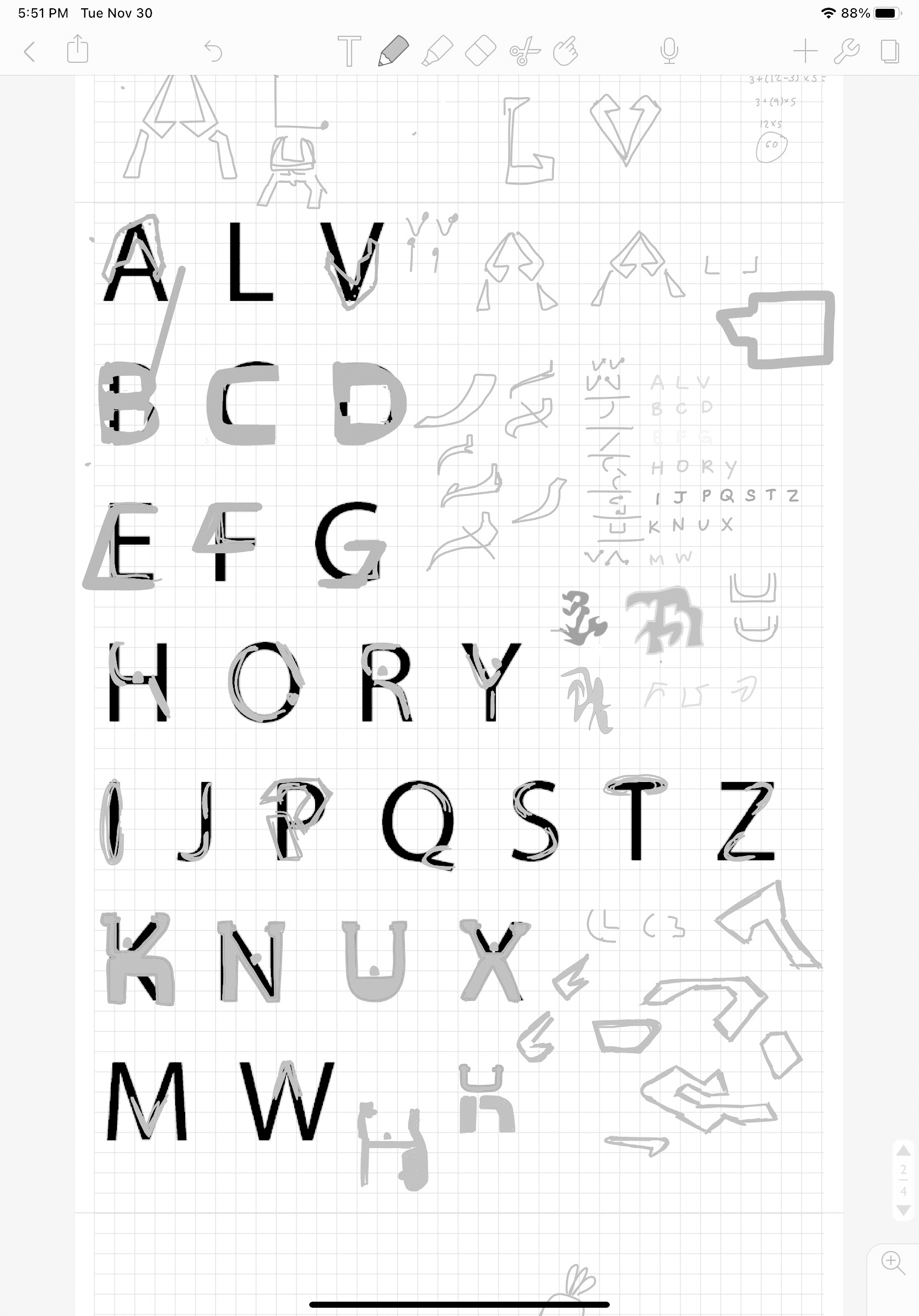
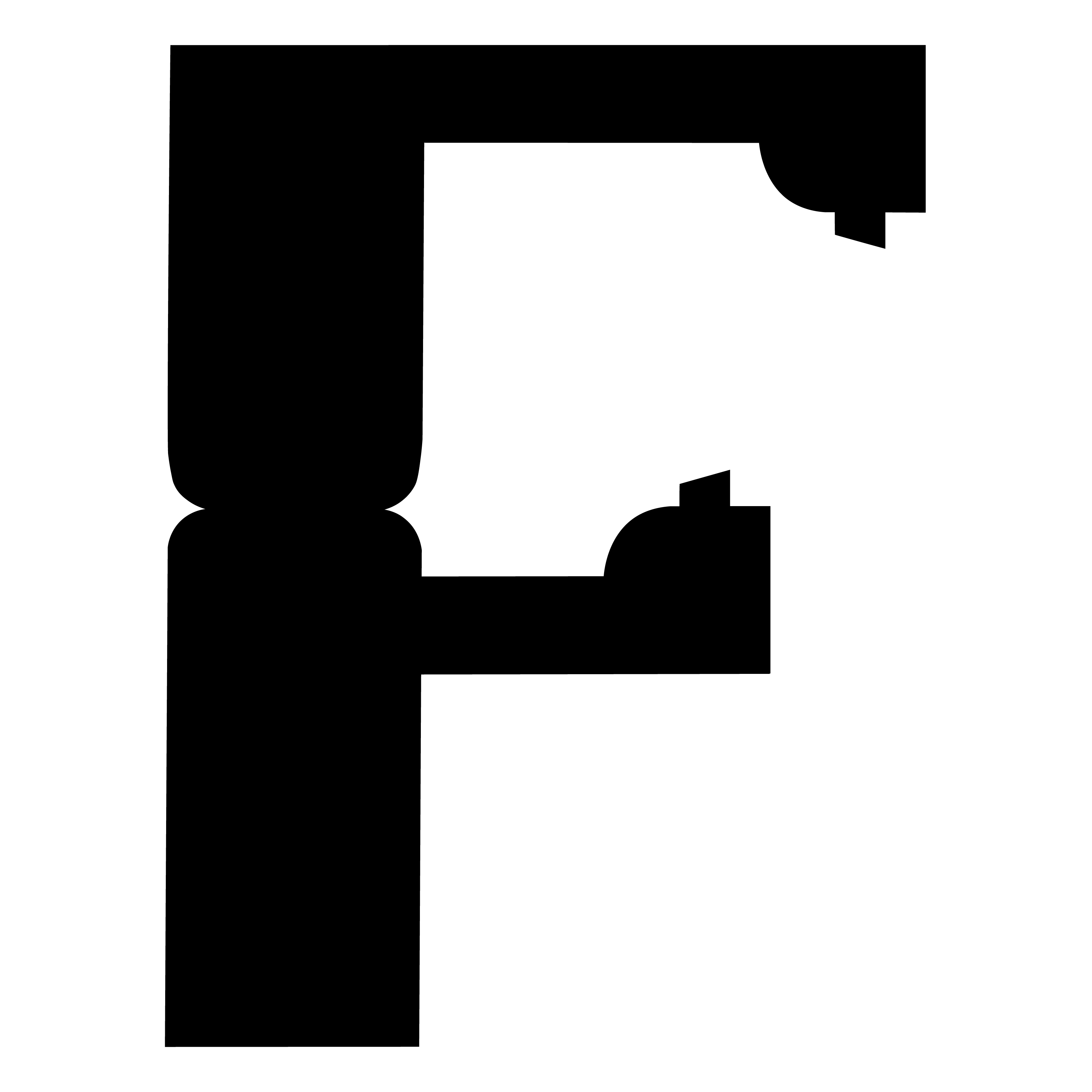
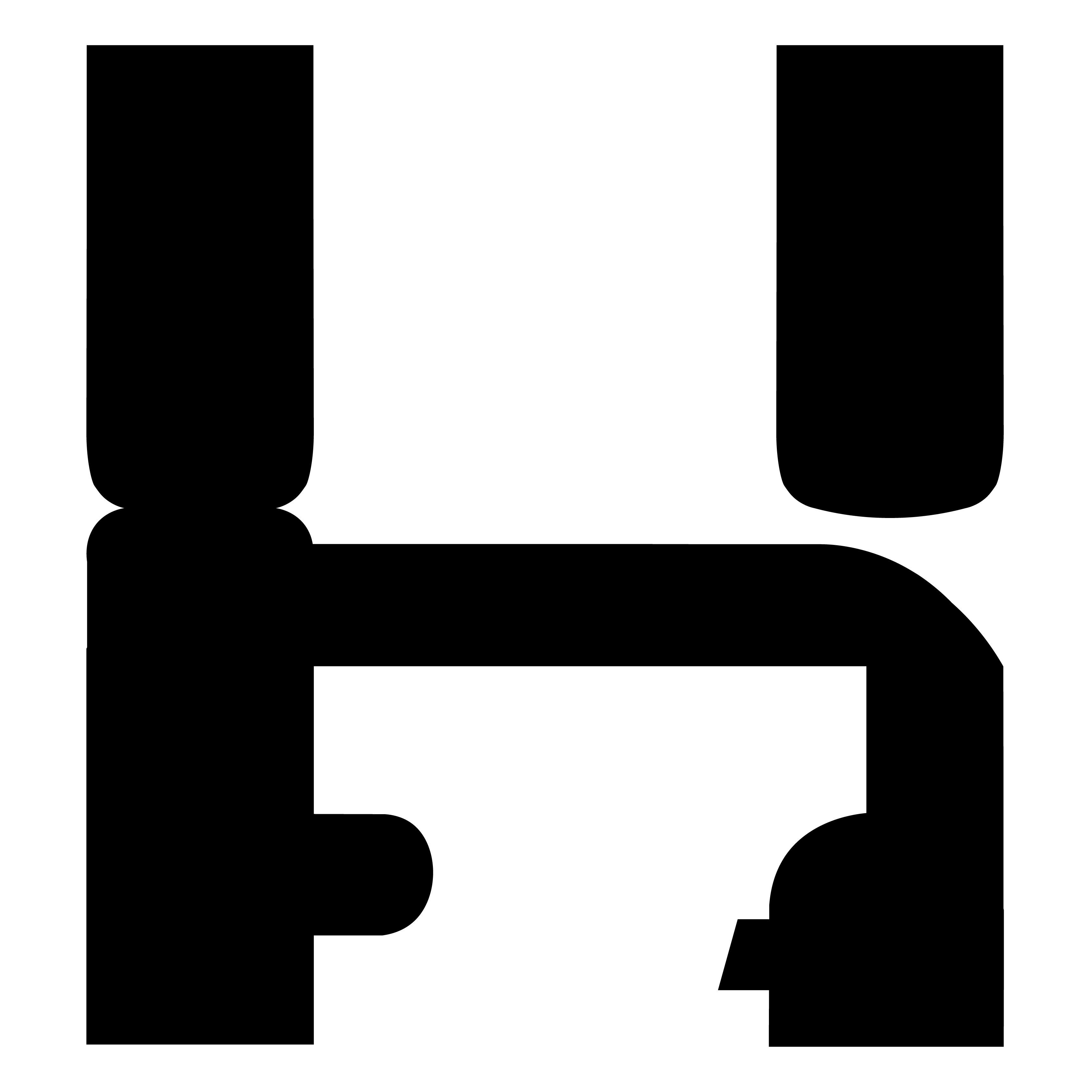
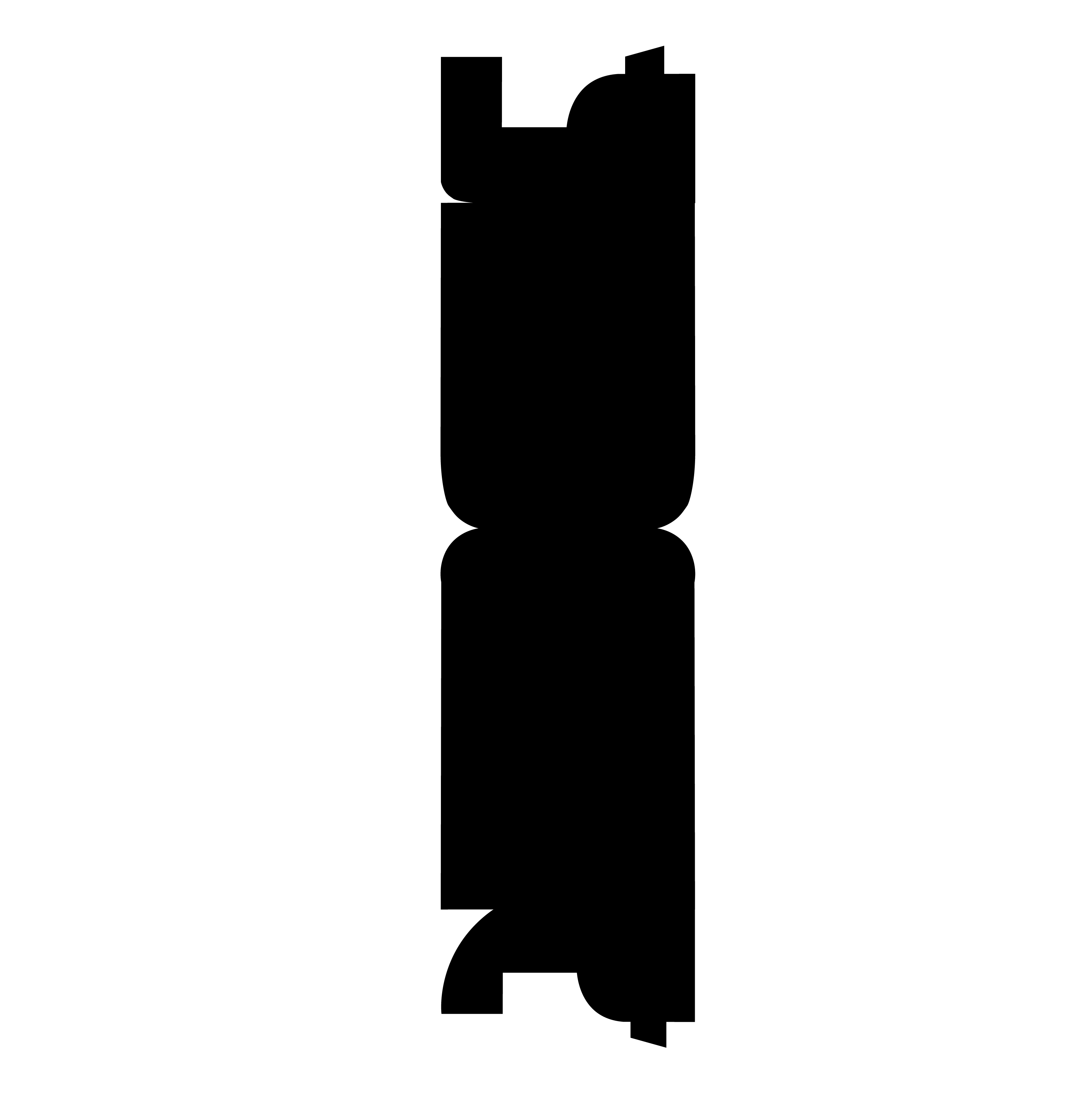
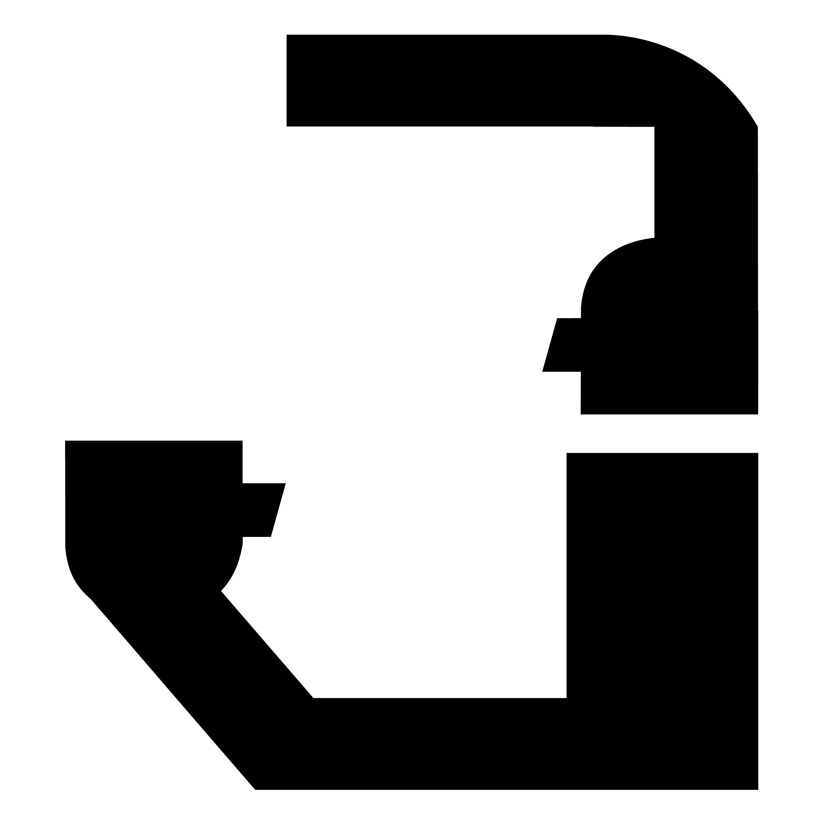
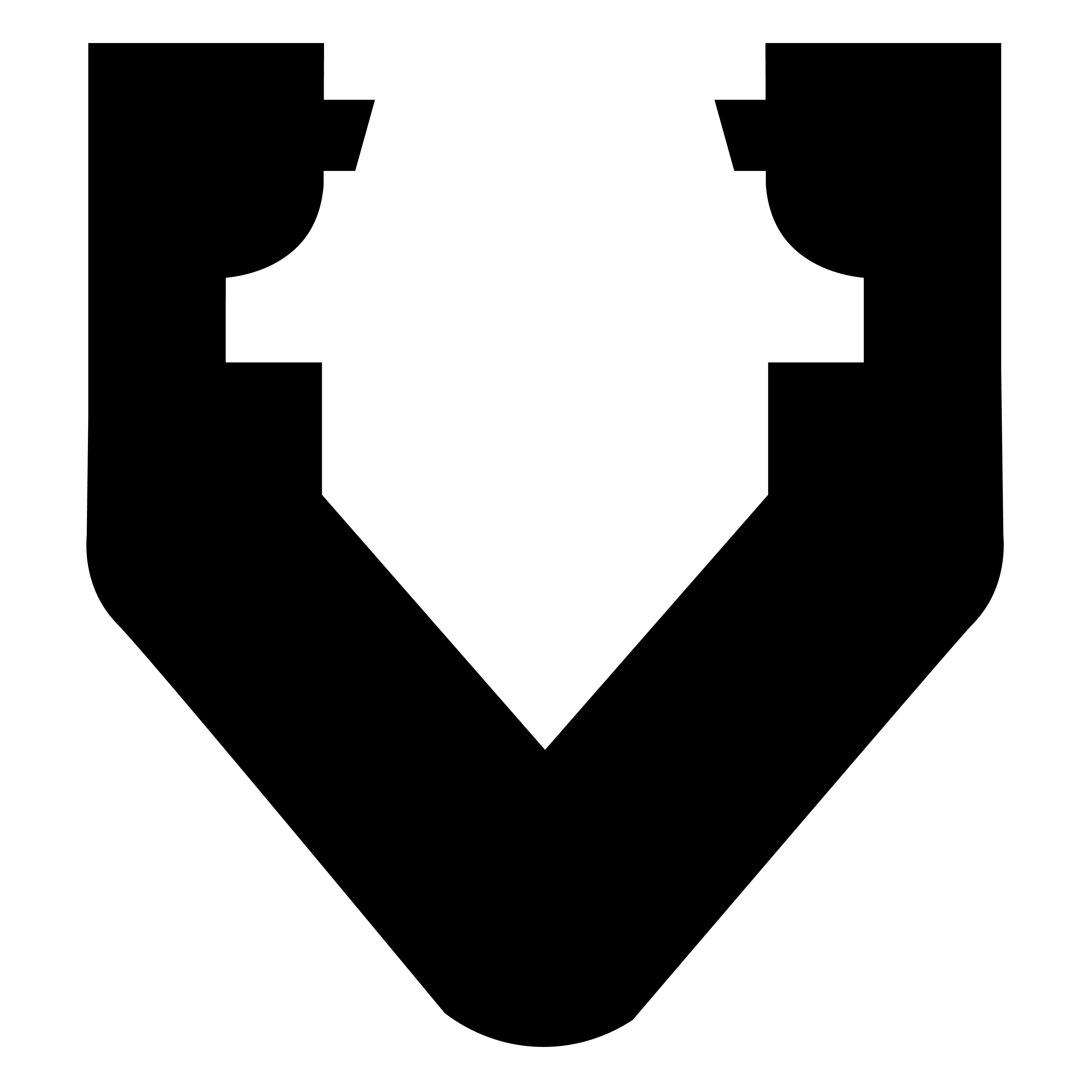
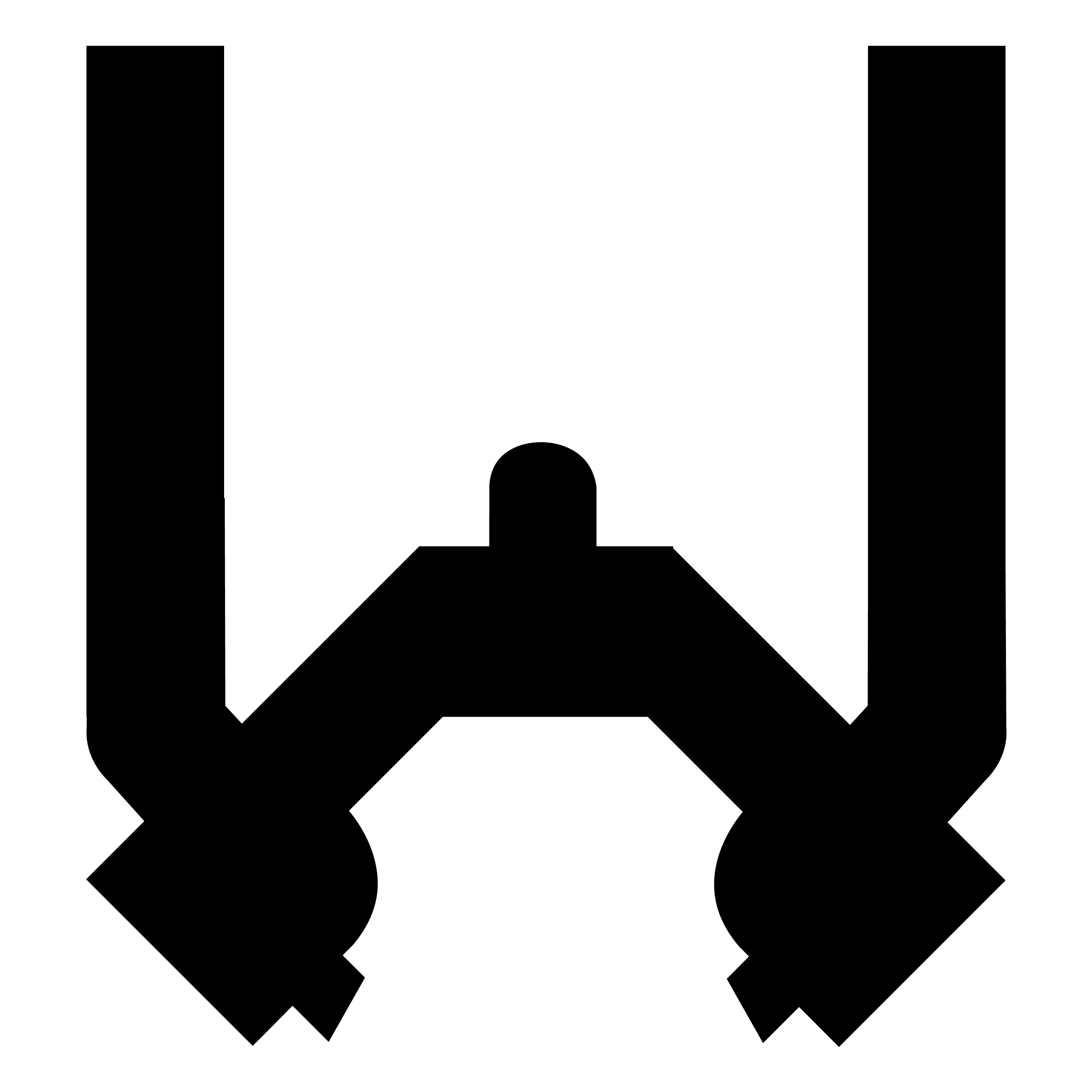
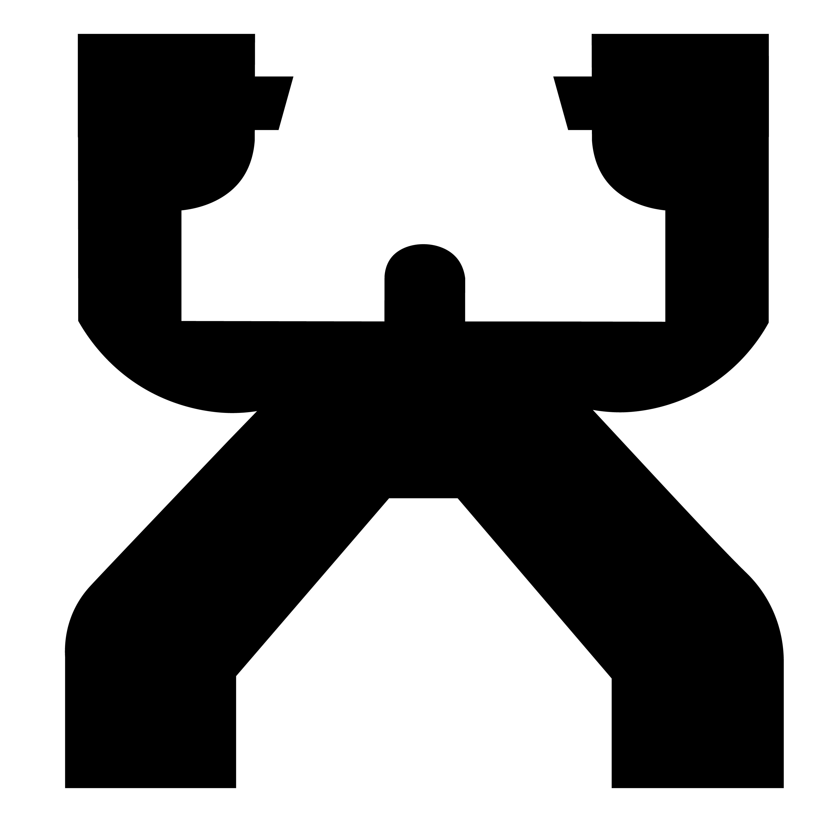
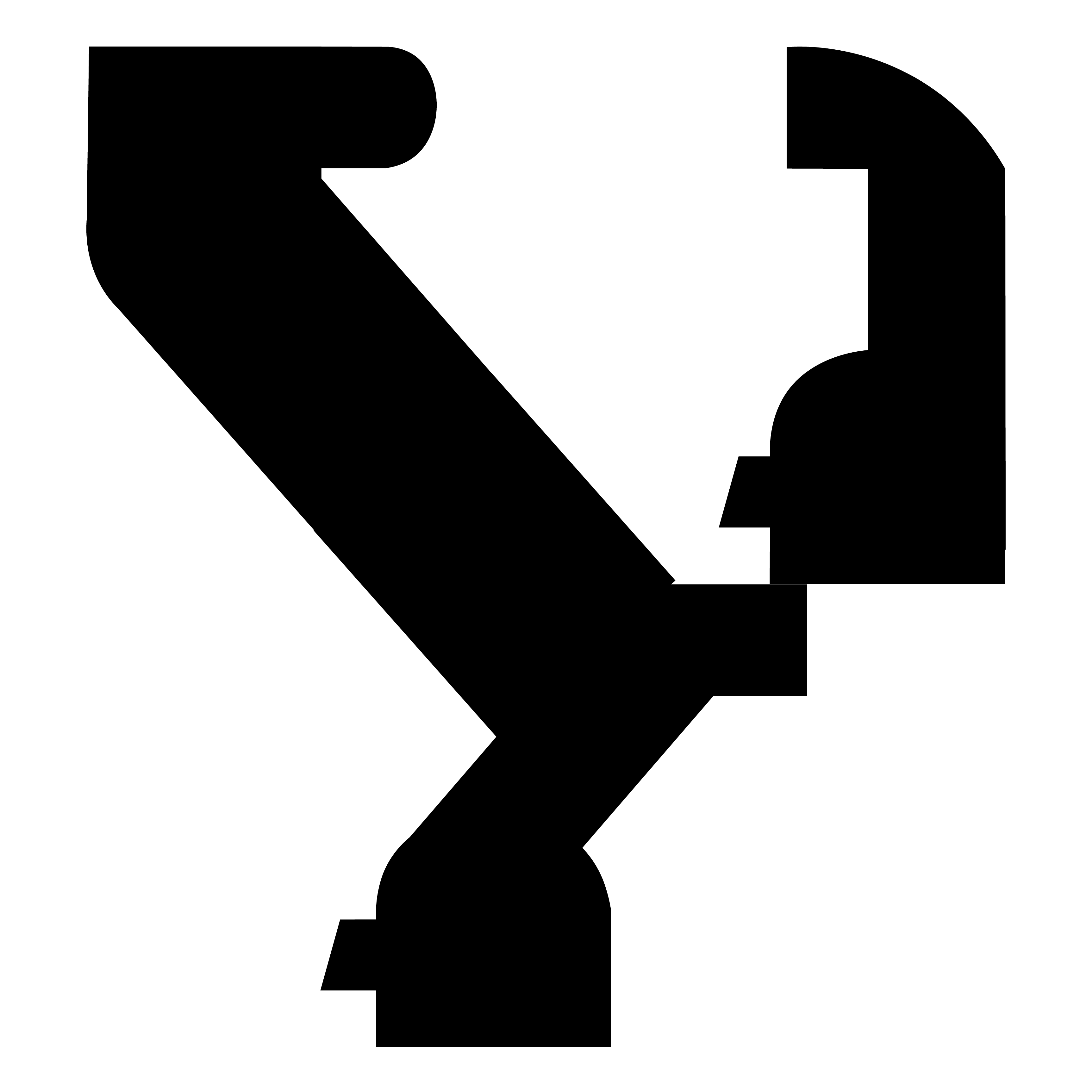
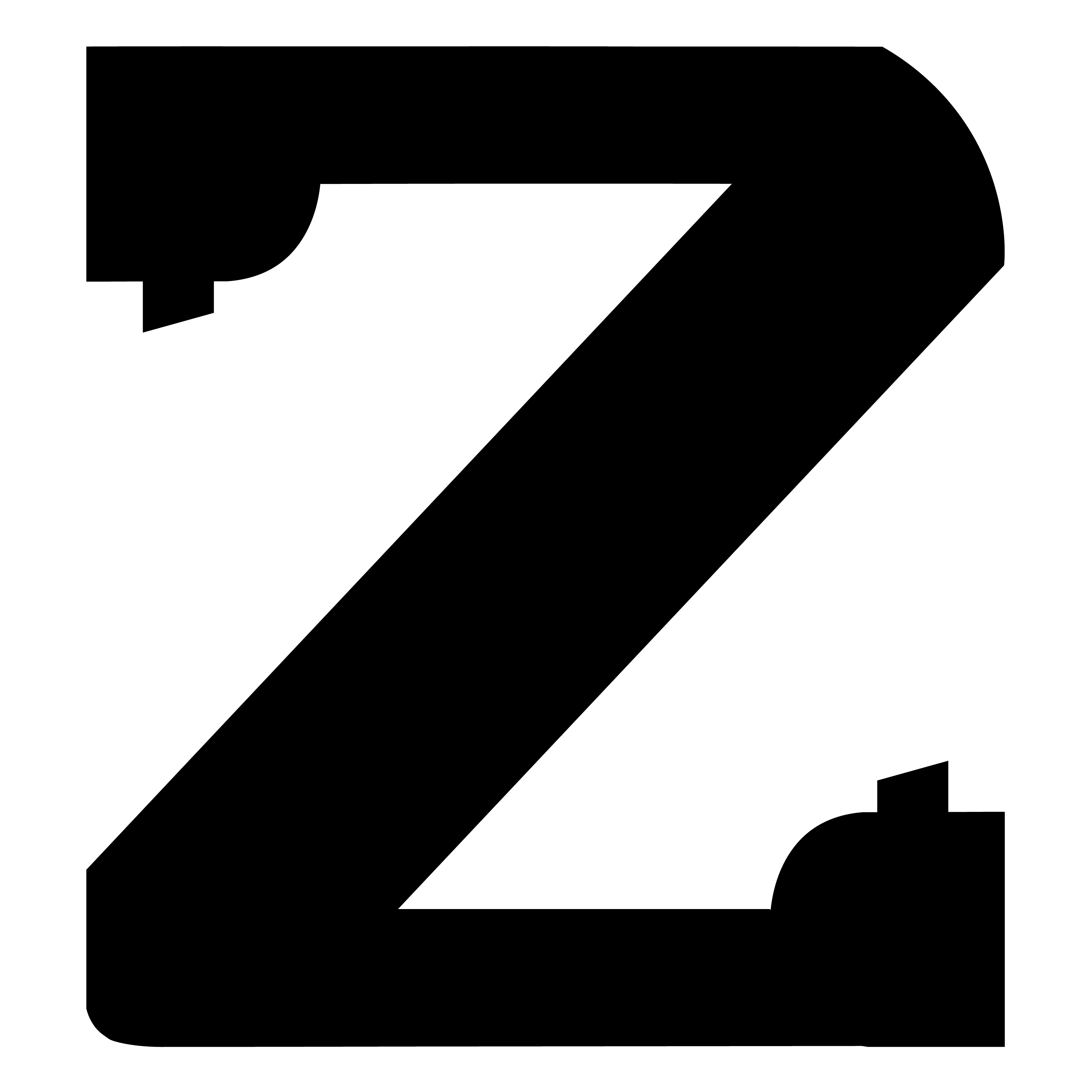
I named my typeface Geumgang, a second degree black belt form that reflects resilience, durability, and spiritual strength. Geumgang translates to “diamond” in English, and also refers a mountain called Keumgangsan, the center of Korean national spirit for its immovability. The name and form is sentimental to me because I won a national competition in Korea with this form. I remember conditioning my body to follow the gestures of each step and understand how much self control it takes to master the posture, snap, and balance the form demands.
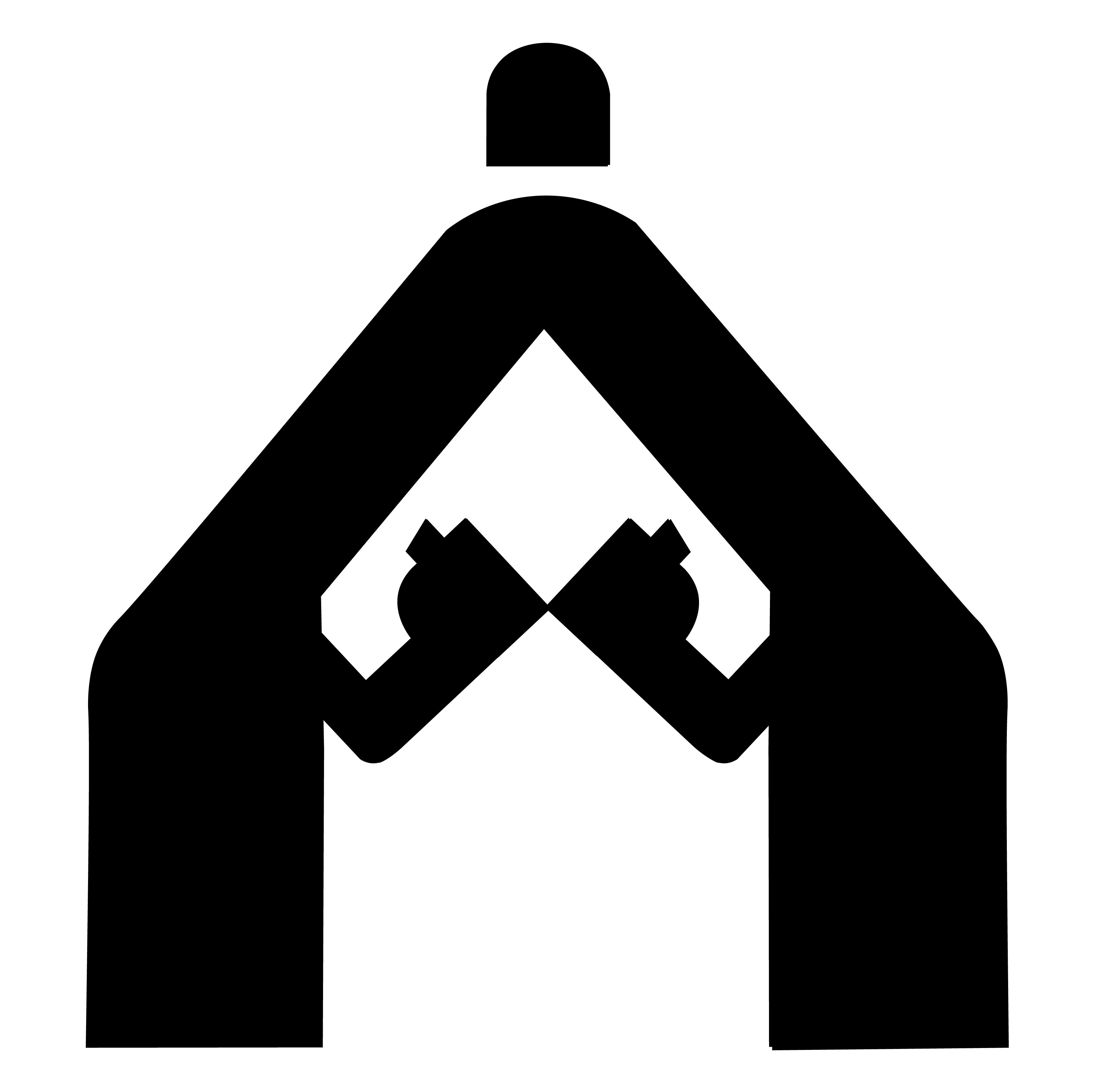
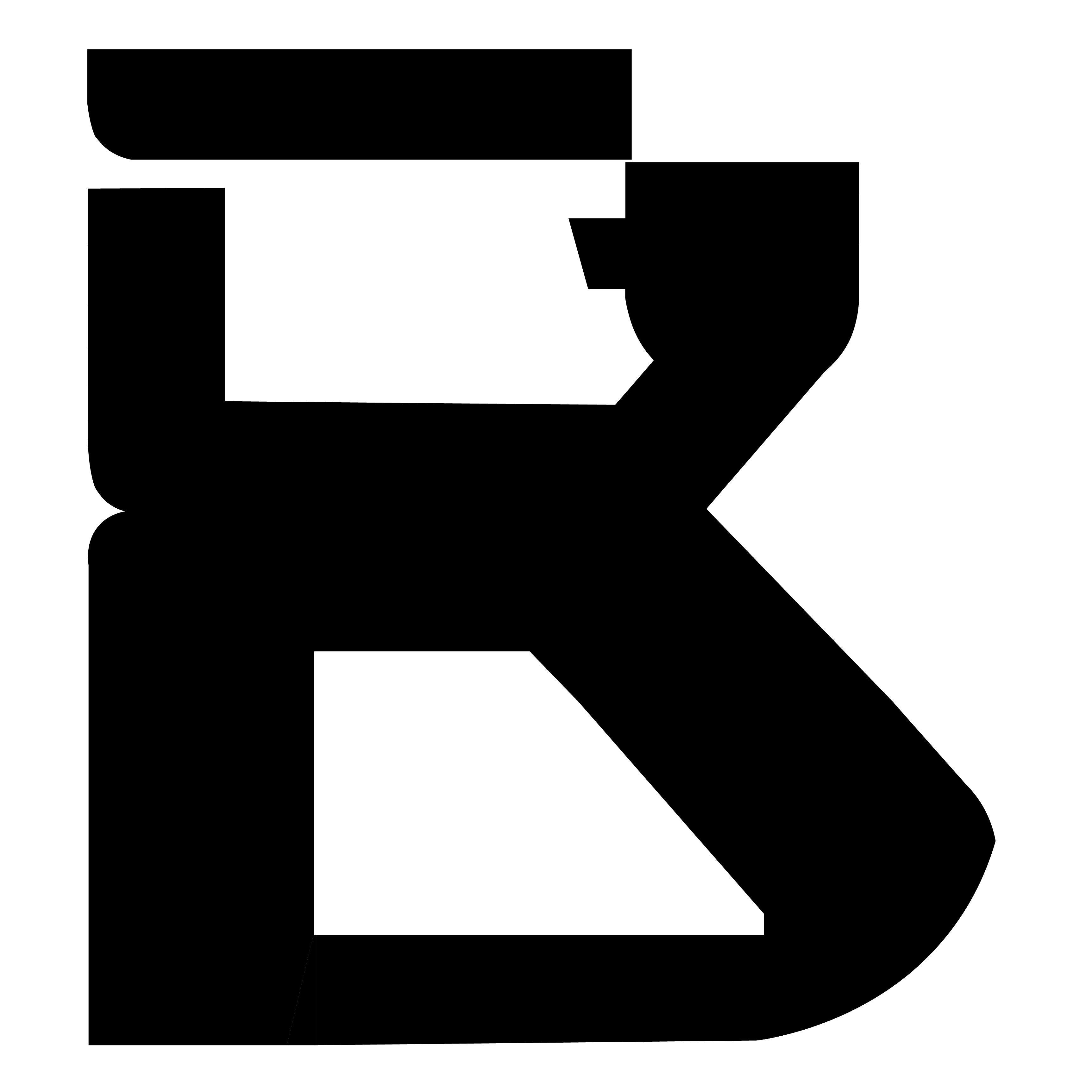
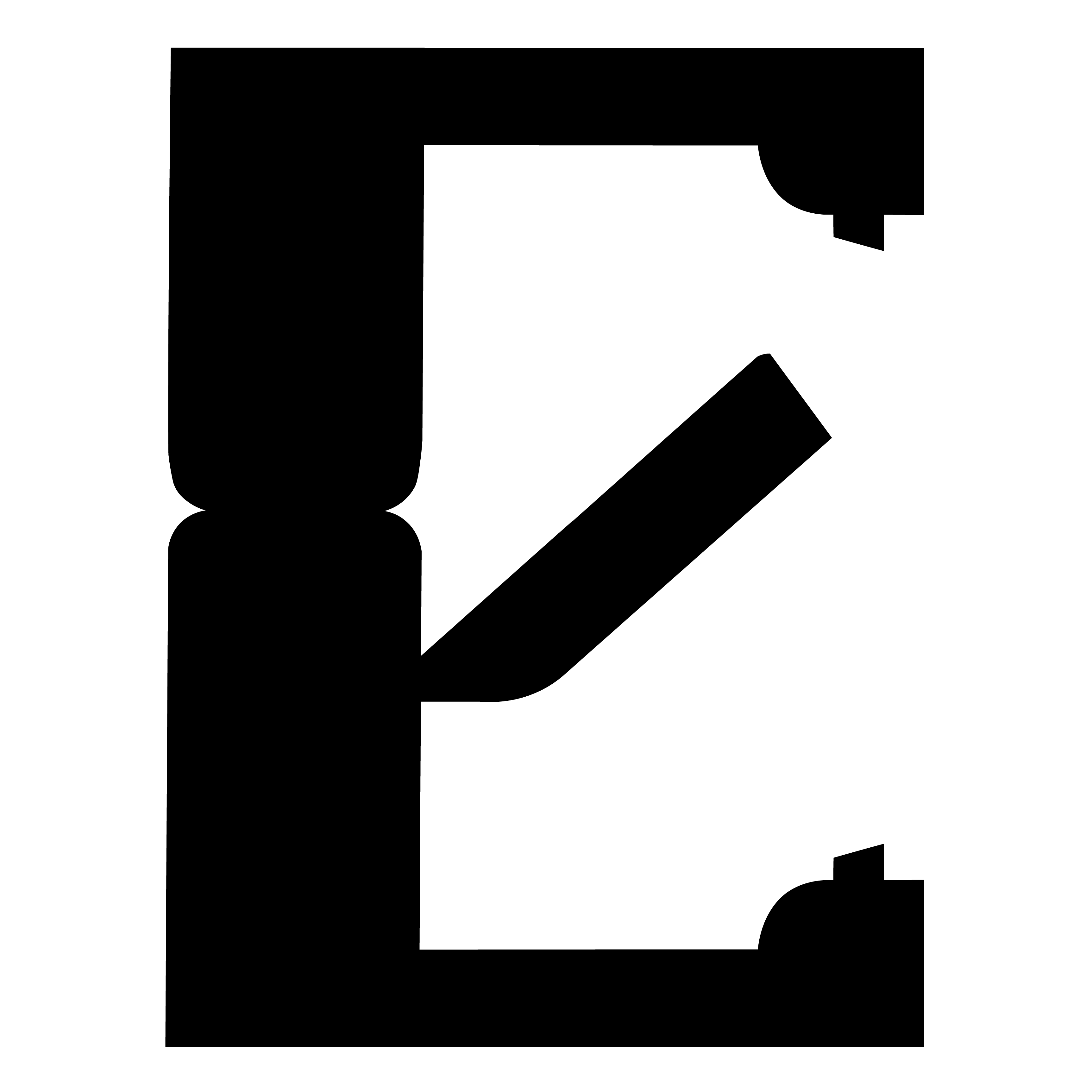
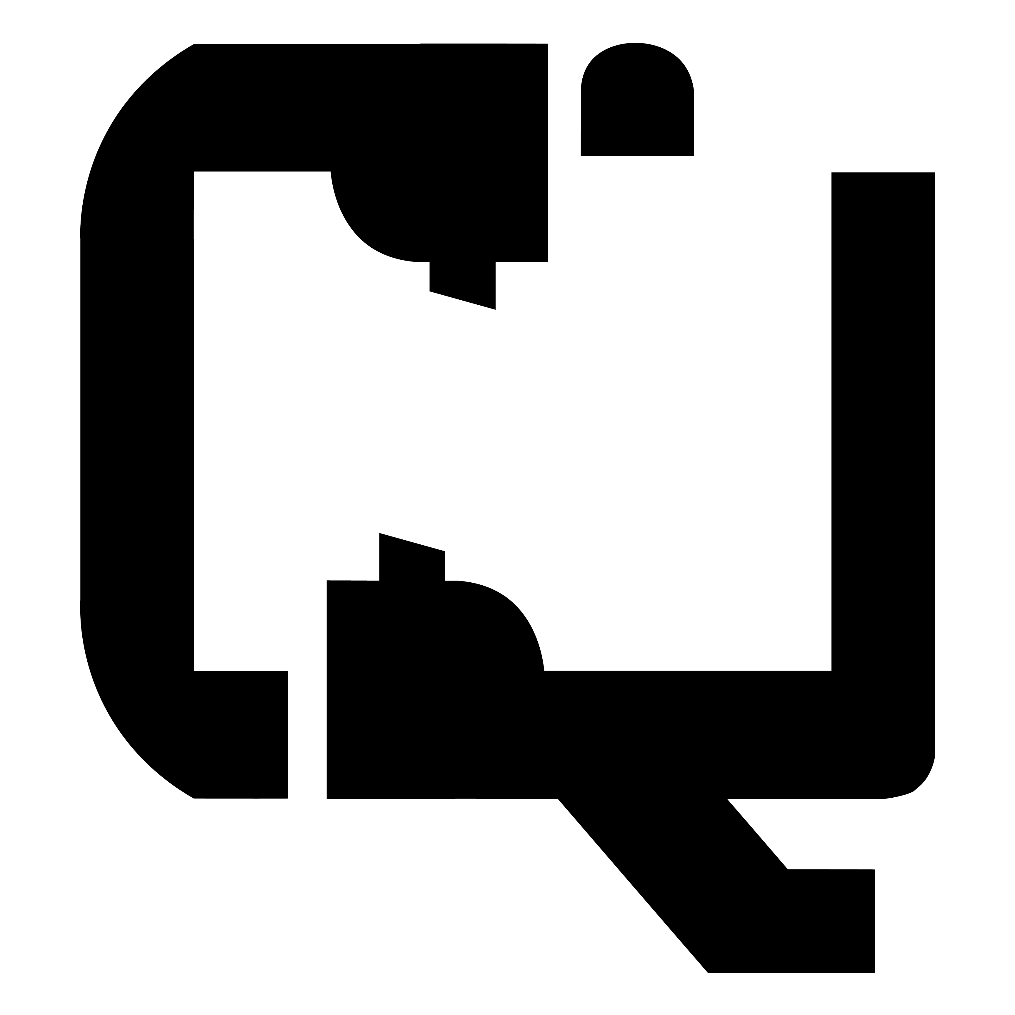
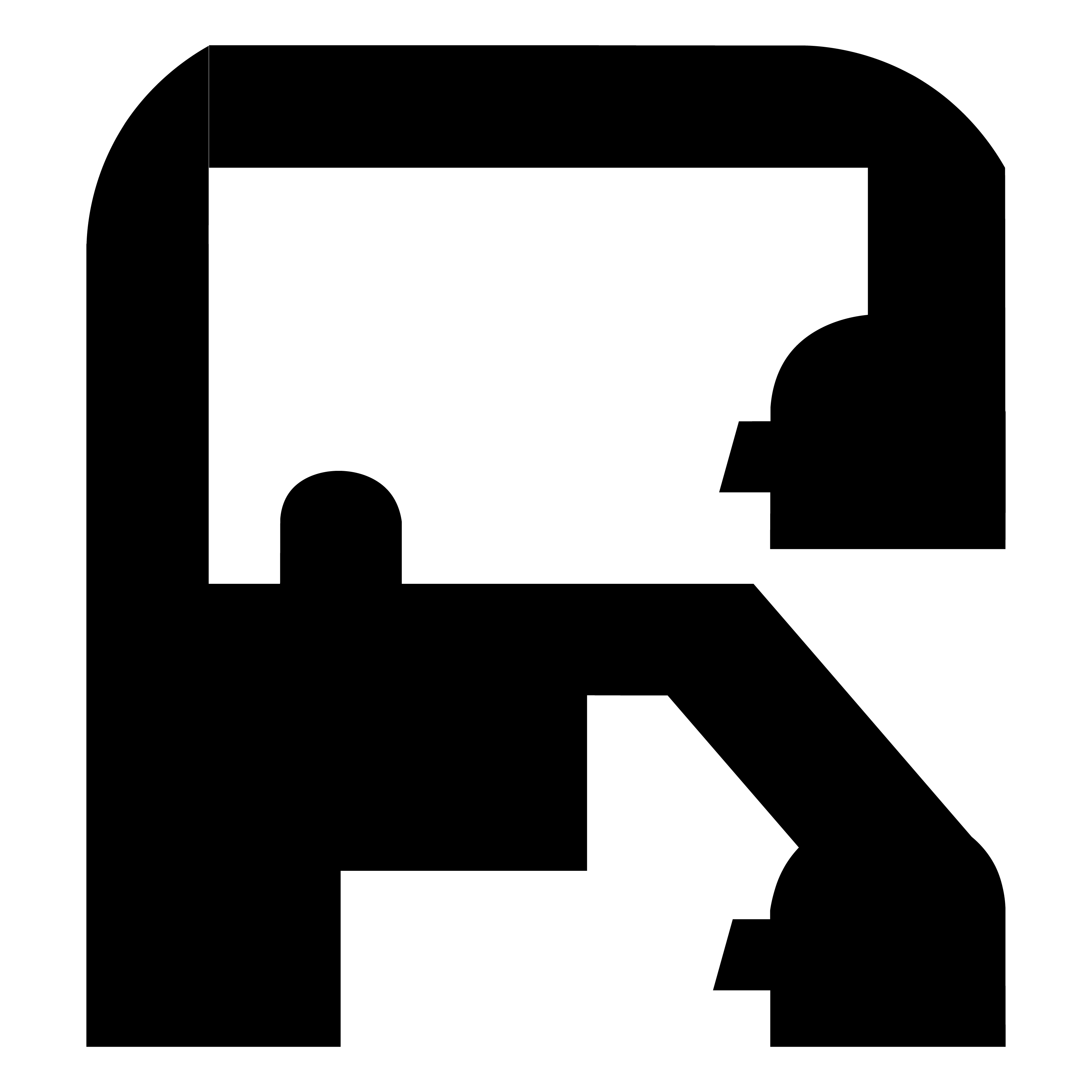
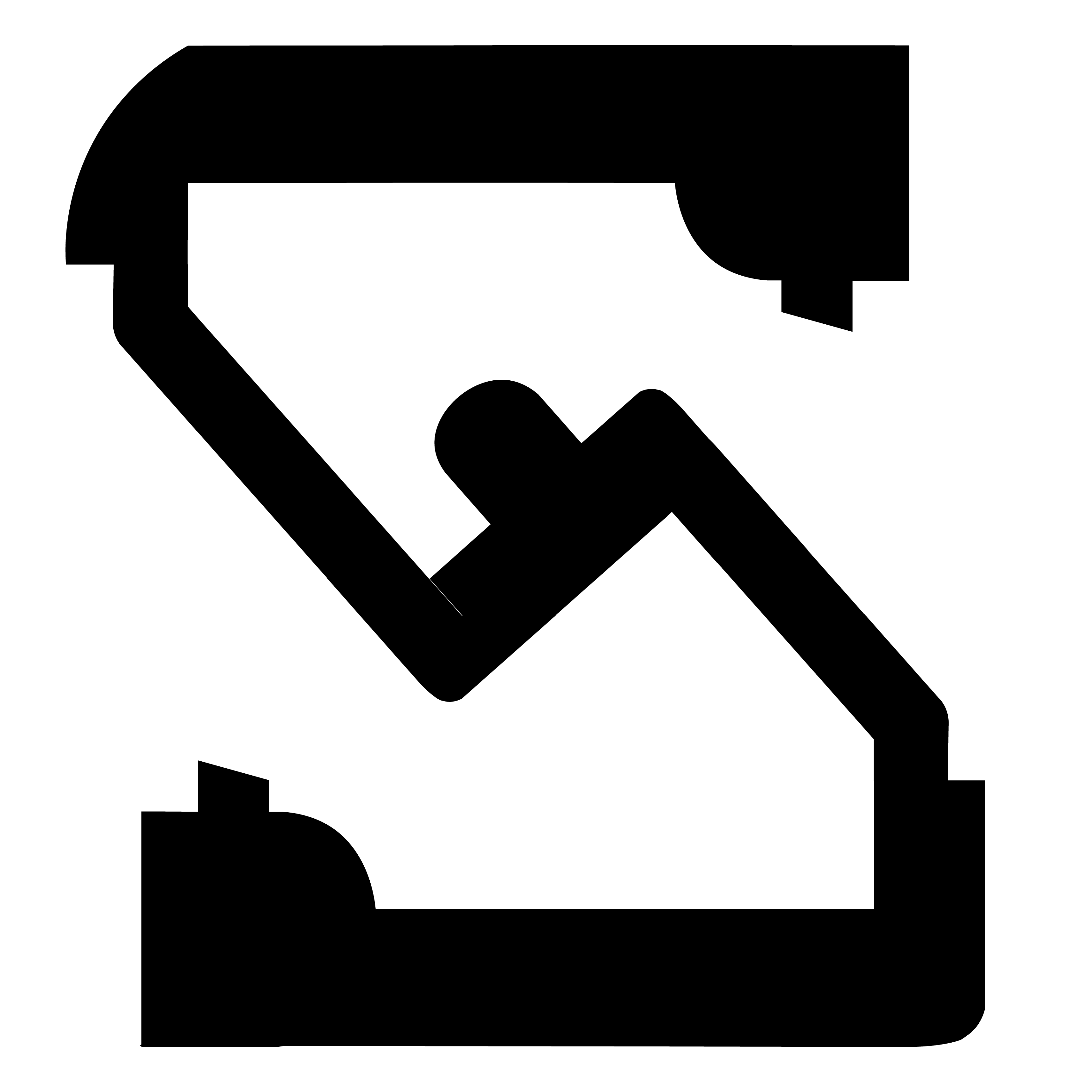
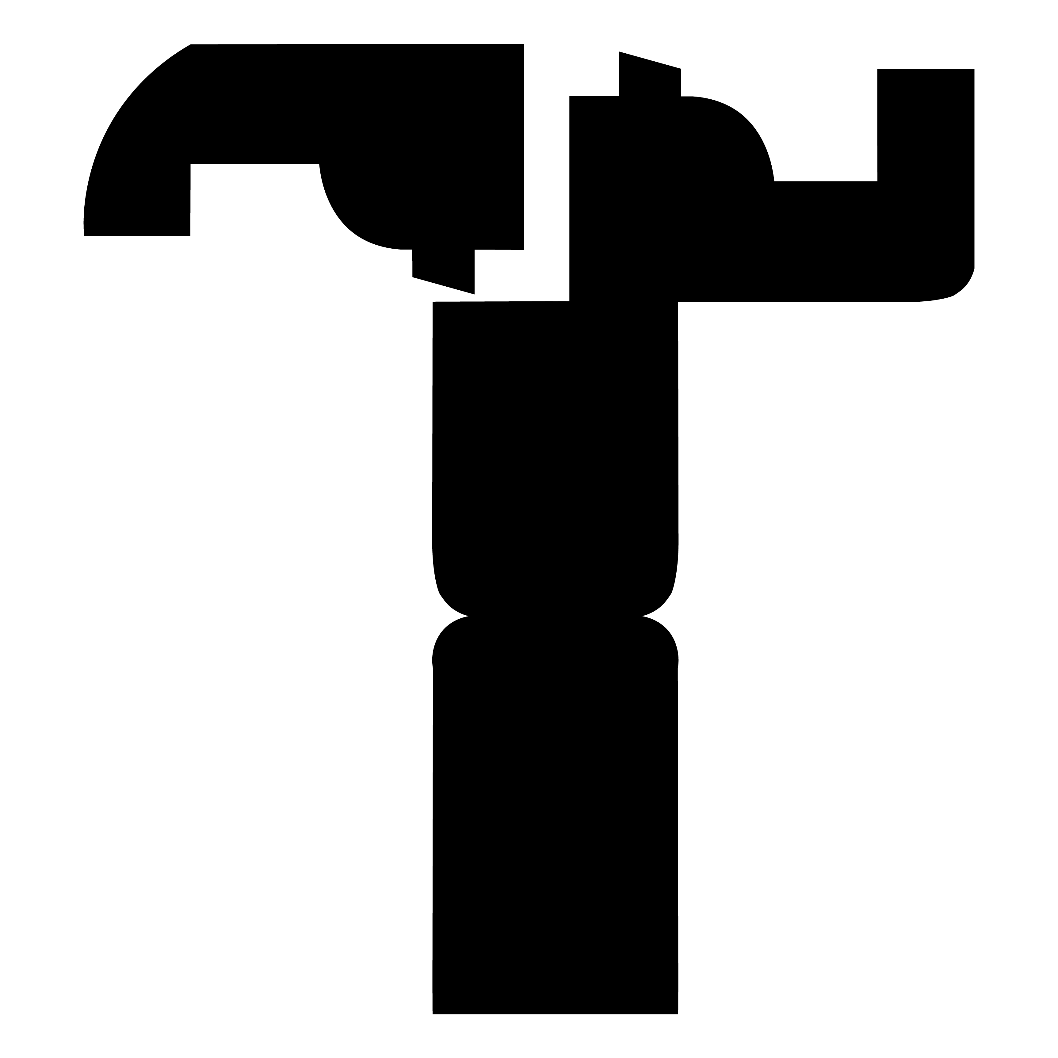
There are 26 steps in Geumgang, so I decided to have each step inspire each letter of the alphabet. Considering the angle of the arms and legs, power of the blocks and punches, and direction of energy flow, I grounded each letterform with the reappearance of a fist or head element. I chose to design in all capital letters so the boxy structure can mirror the right angles, closed fists, and bent knees of the moves.


View full type specimen booklet here