
I Think About You When I Cut Fruit
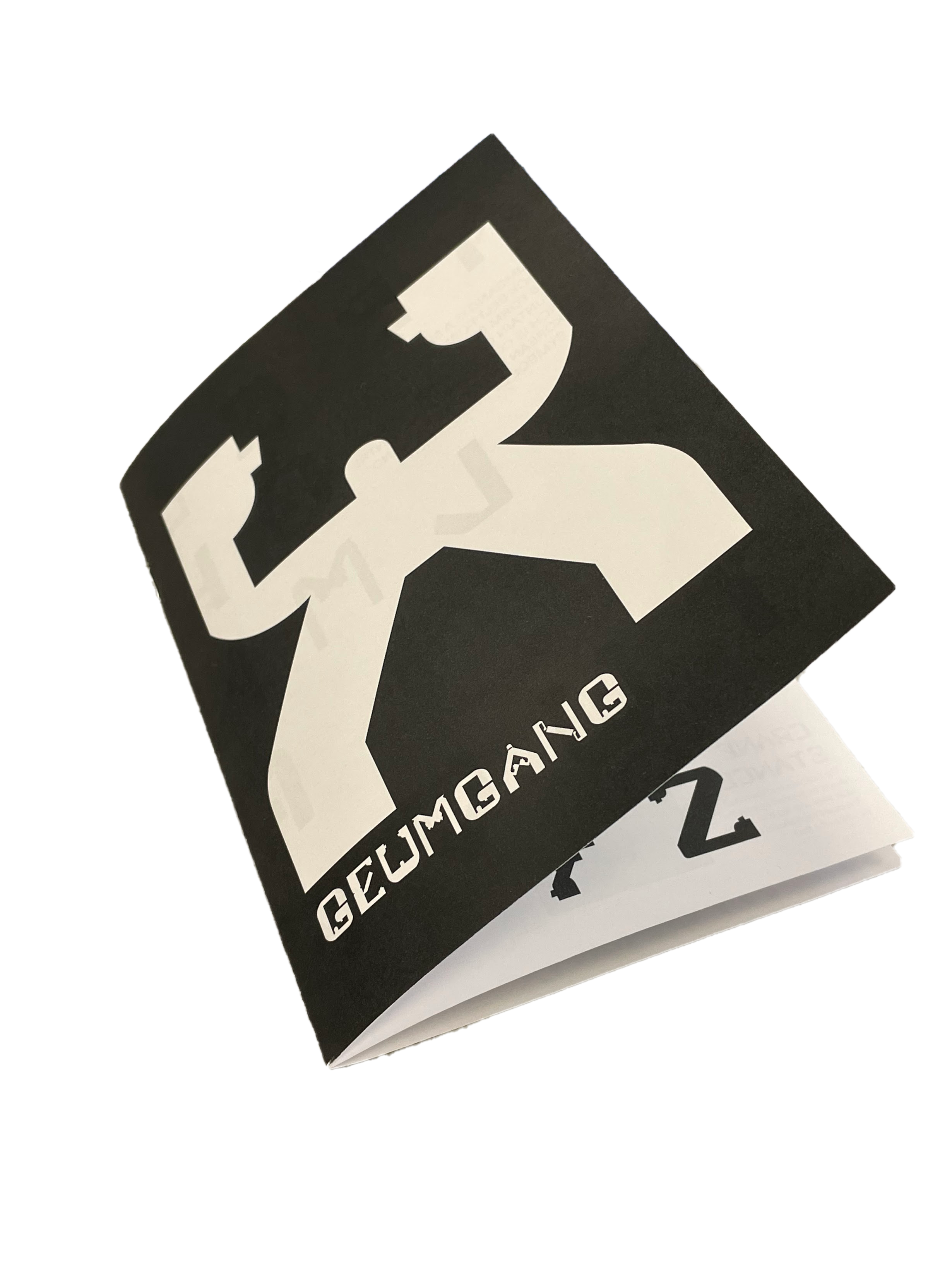
FEB 2022 - MAR 2022 ︎ Letter Magnets
[Skills] Typography
[Tools] Robofont, Lasercut Acrylic, Felt
This project challenges how typography operates beyond the viewer experience of a page or screen at a larger scale and in a physical environment. I was immediately invested in displaying the message for parental love and sacrifice.
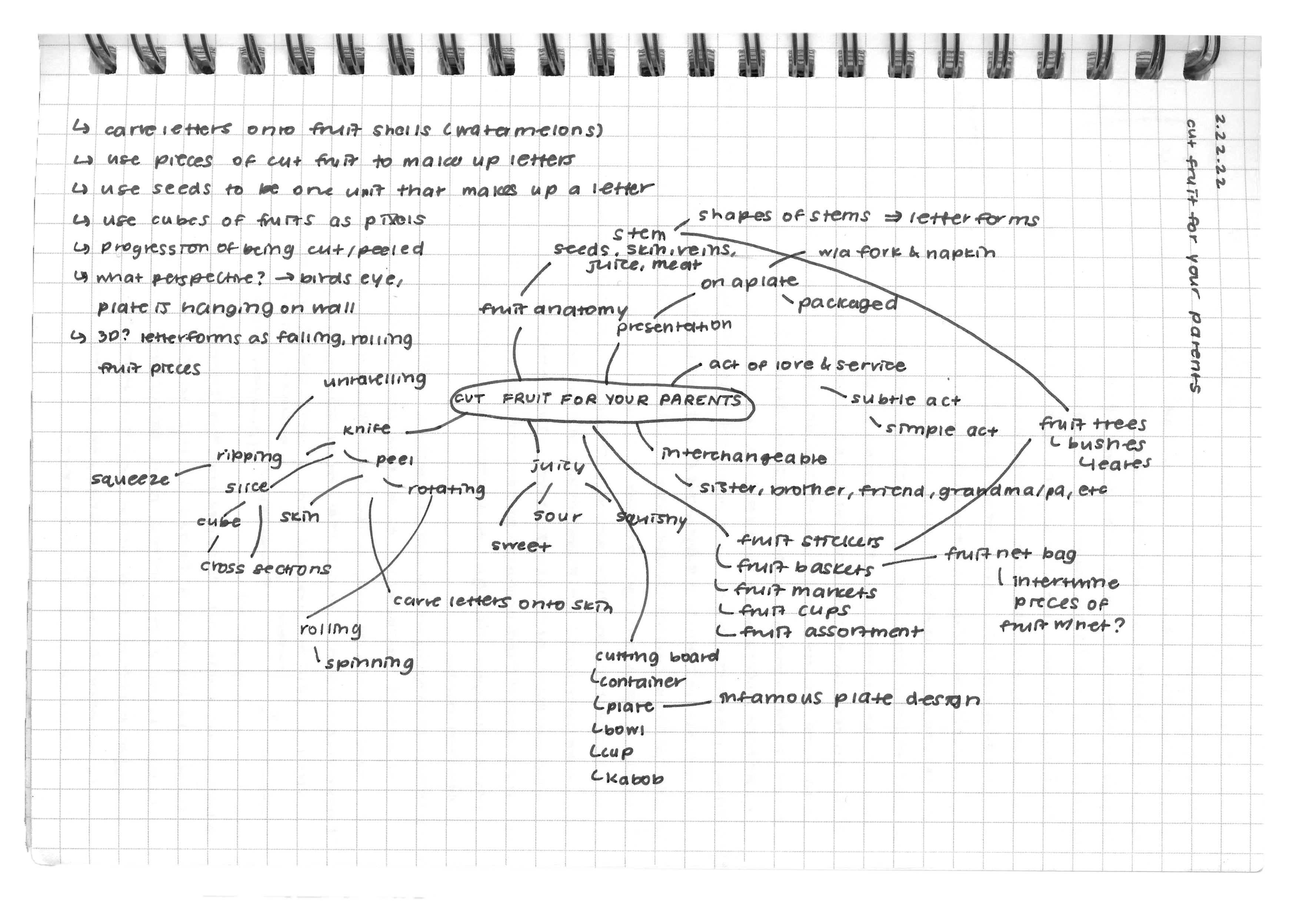
Mindmap exploring the visual potential of the act of cutting fruit for your parents
Being in college made me want to learn about my parents as people before raising me, and I experienced how our relationship changed after that shift in understanding. When my parents in their newly wed years ate dinner with their friends at home, it was normal for the men and women to break up into their own groups. My mom and her friends peeled fruit together for dessert while enjoying lighthearted gossip. When my mom looked after me and my siblings, it became tradition to feed us peeled fruit when we stayed up late studying. I wanted my audience to read this displayed type as multiple love languages. Throughout this project, there is a duality between acts of service and words of affirmation, giver of labor and receiver of labor, and the internal and external.
Sketches of letter magnets
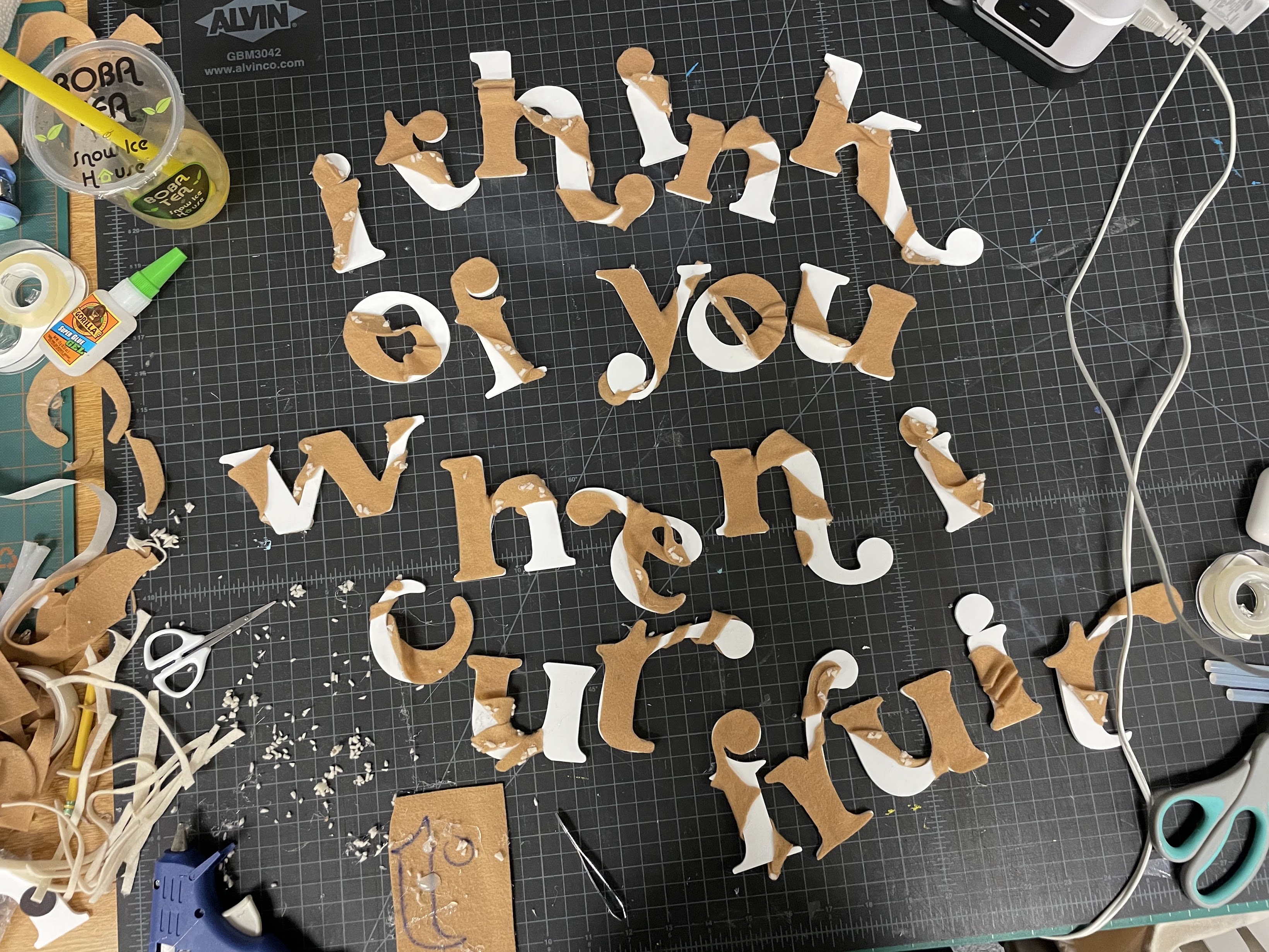
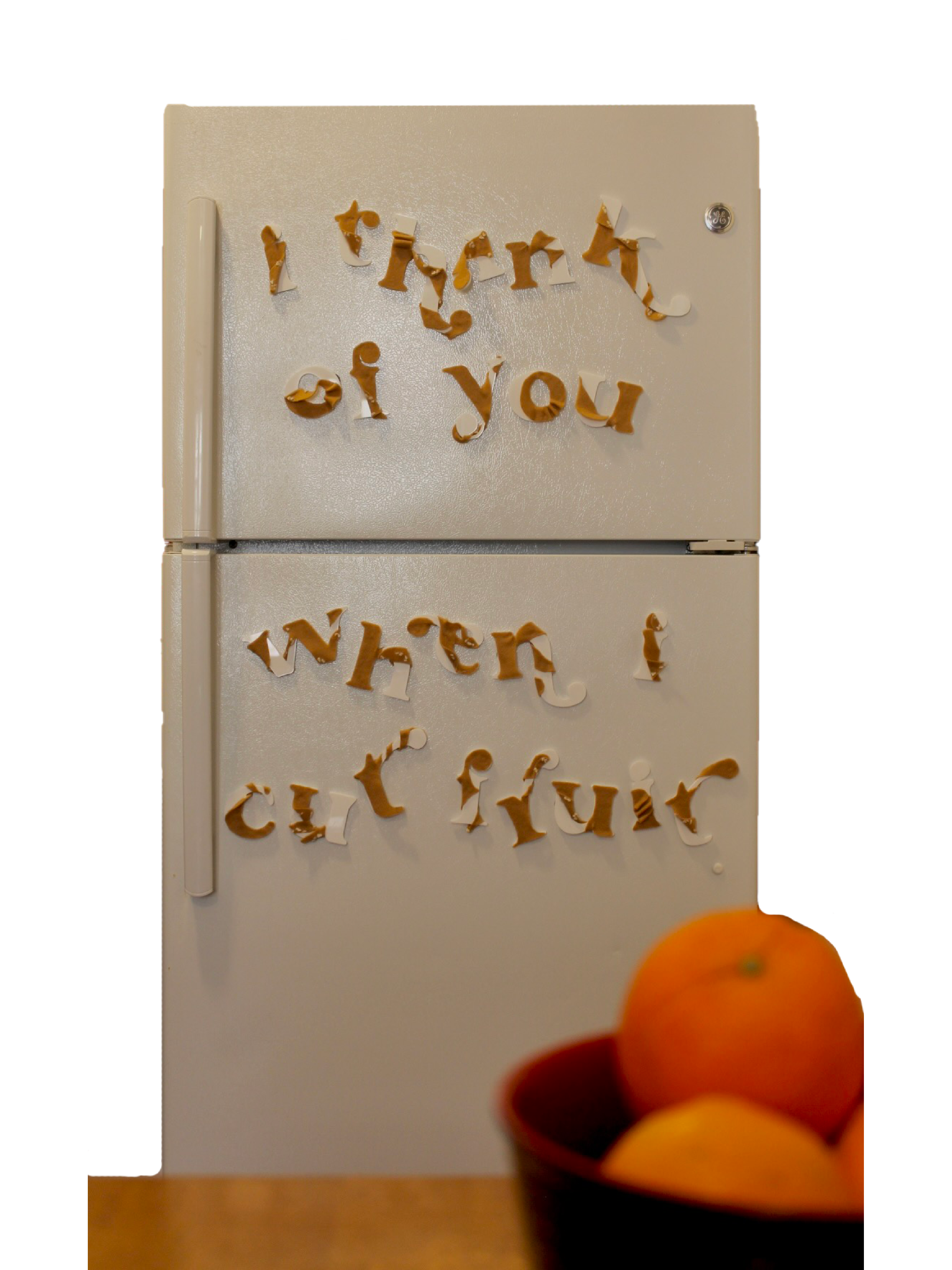
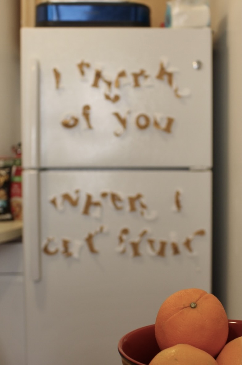
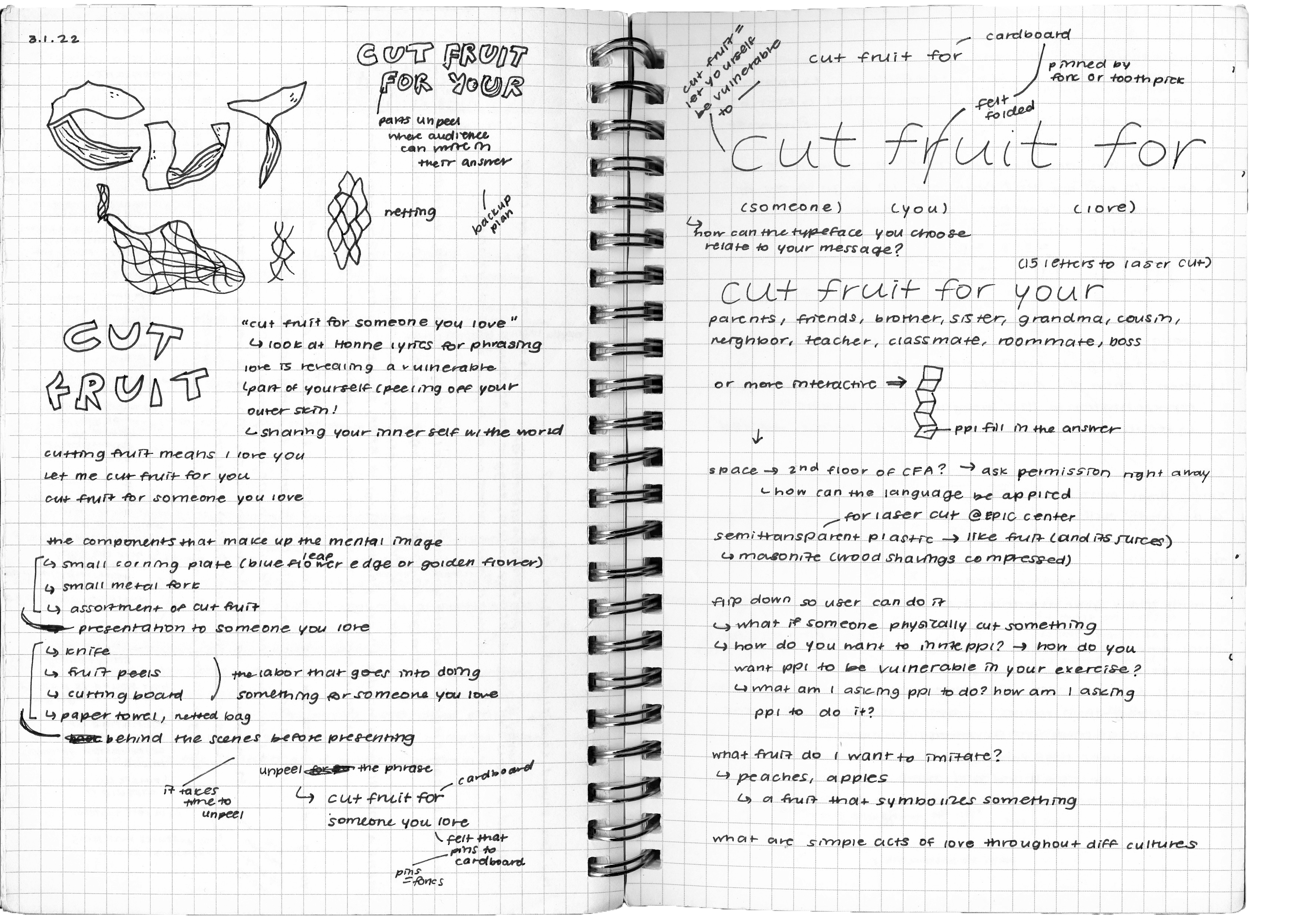
There are two sides to cutting fruit. The one who gives fruit after the labor of chopping the fruit on a cutting board and the one who receives the neat plate of cut fruit. While you are peeling the skin of a fruit, you are also peeling away a layer ofyourself to open up to a person you love. Therefore, I chose to write the message as “i think about you when i cut my fruit” to sum up this act of love. This message is intended to read as letter magnets on a refridgerator because when you open the fridge, you can think about who you want to cut fruit for as well as who has cut fruit for you. The fridge is also where parents proudly hang up their children’s artwork, so the letter magnets are a nod to that nostalgic tradition.
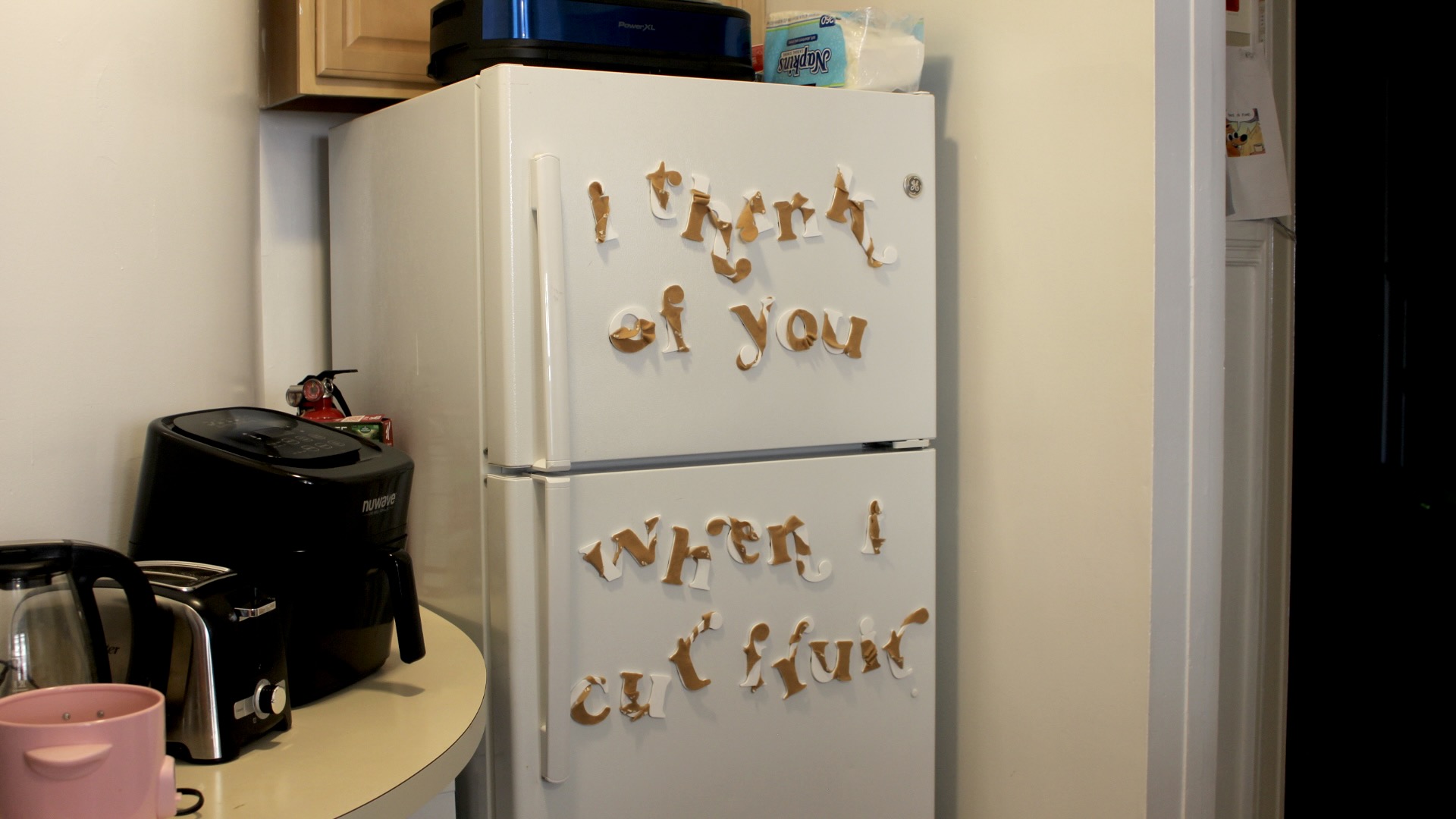
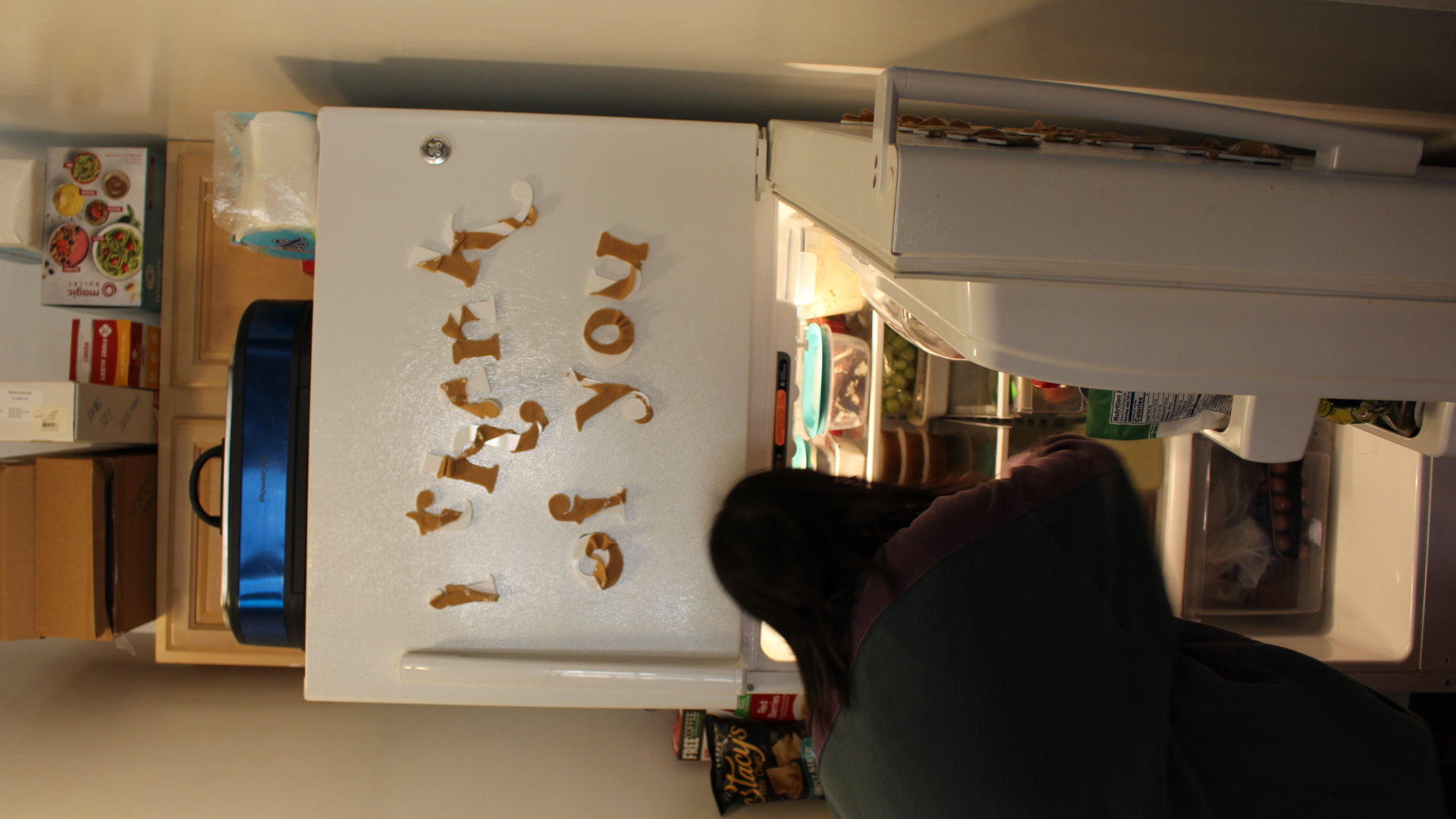

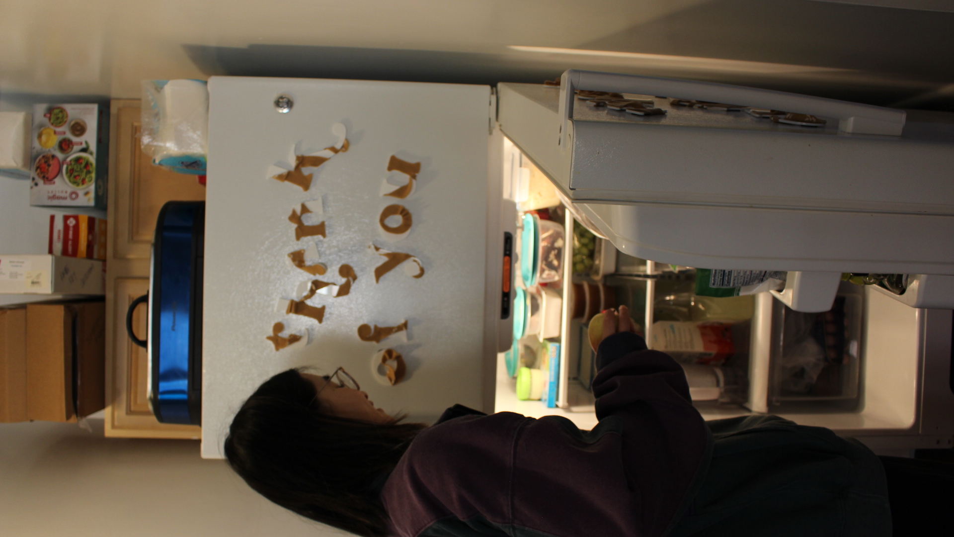
I want the reading experience of the message to be a time to feel reflective and vulnerable. When there is a message on the frige and you read it, you can either hear someone say it to you or hear yourself say it to someone. That silent affirmation can resonate with you and remind you of who has fed and nourished you before, and who you will feed in return.
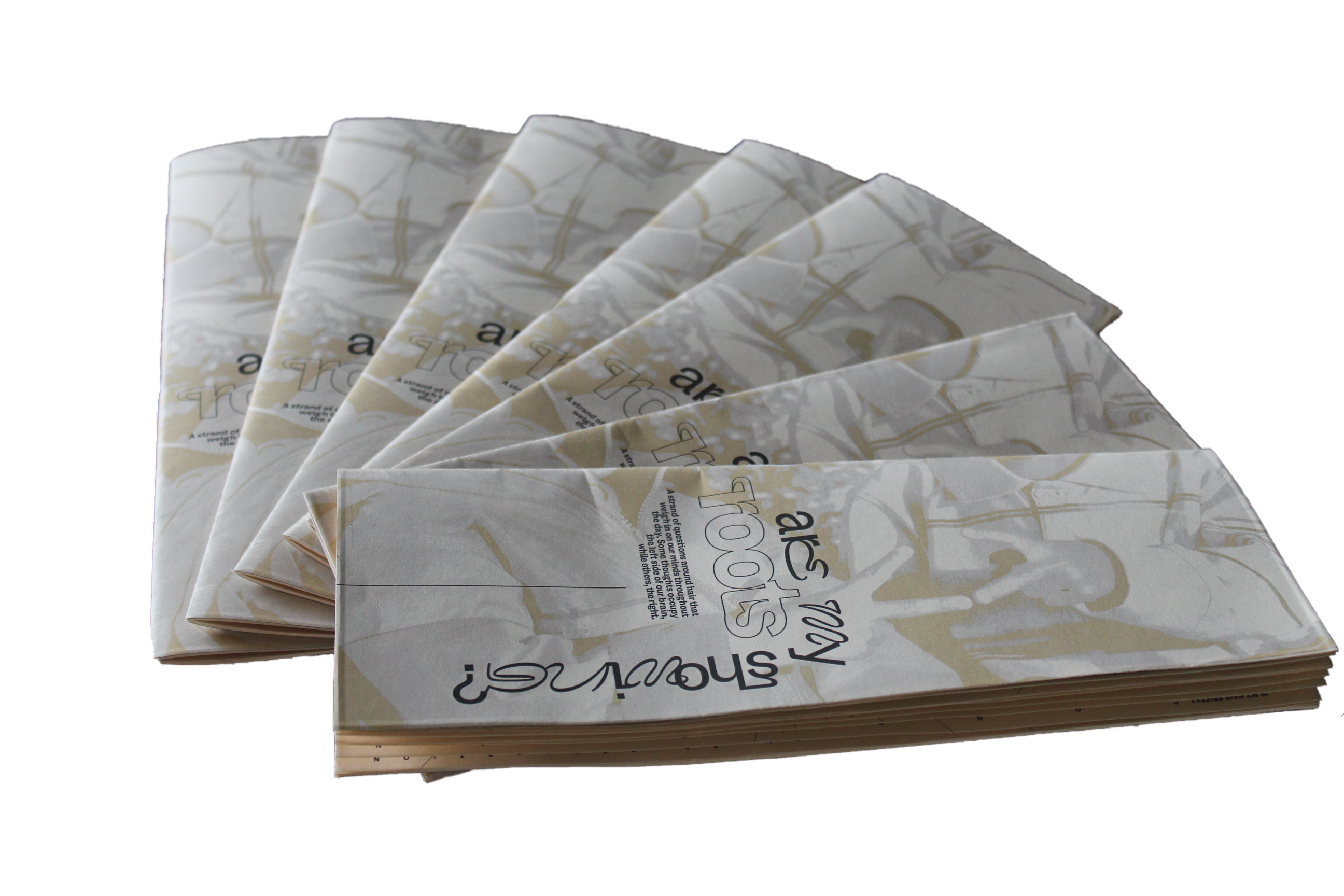
I customized a typeface based off Sweetest Goods’ Apricosa (2020). It is a modern take of a vintage typeface, with bold serifs and elongated arms. The typeface is designed to be versatile and used for projects like wedding invitations. I felt that this typeface was warm and welcoming, and the letterforms were wide enough to hold a magnet adhesive to be attached to the acrylic letterform. I redesigned the letterforms to exaggerate the characteristics of the typeface so that it is even more reminiscent of a peel from a fruit.
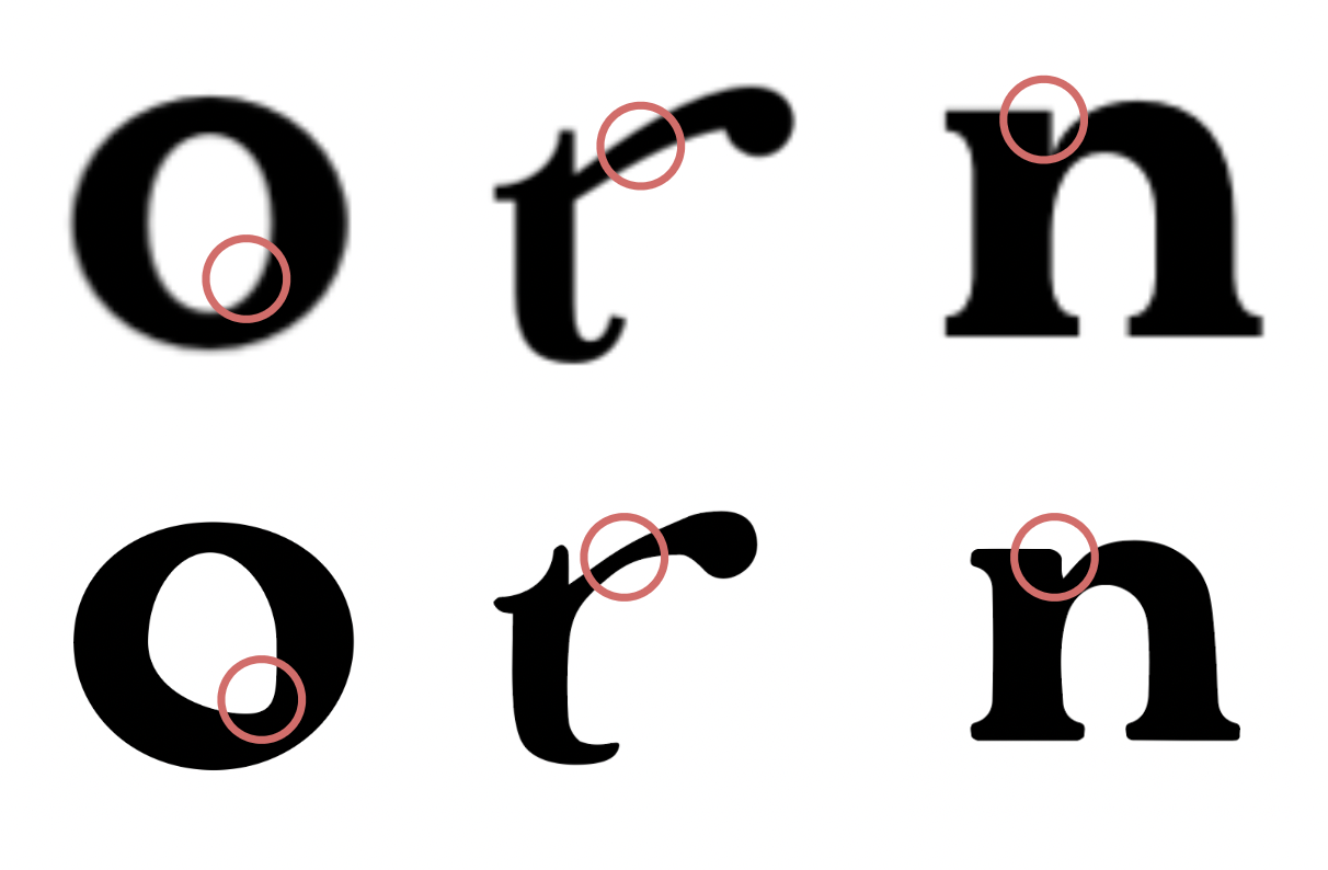
[Top: Apricosa, Bottom: Customized] I exaggerated the elongated serifs, softened the curves of the stems, and changed the bowls and tittles to have a more organic, seed-like shape.
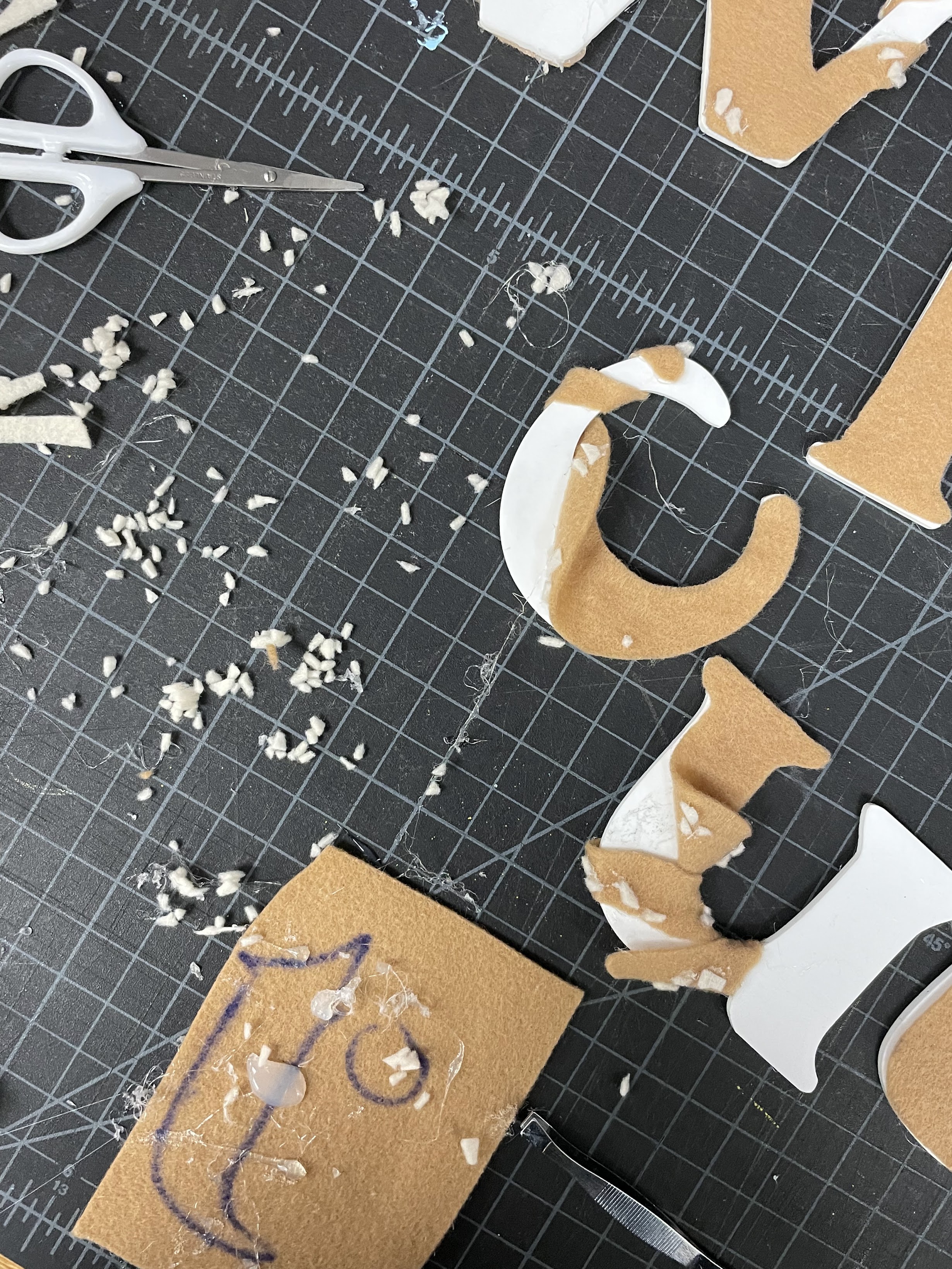
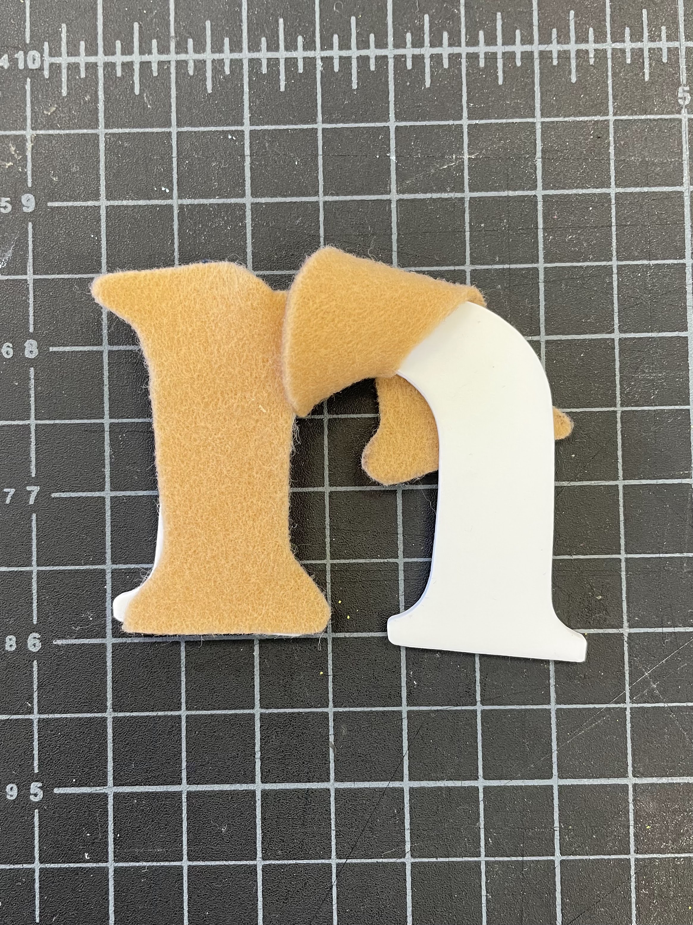
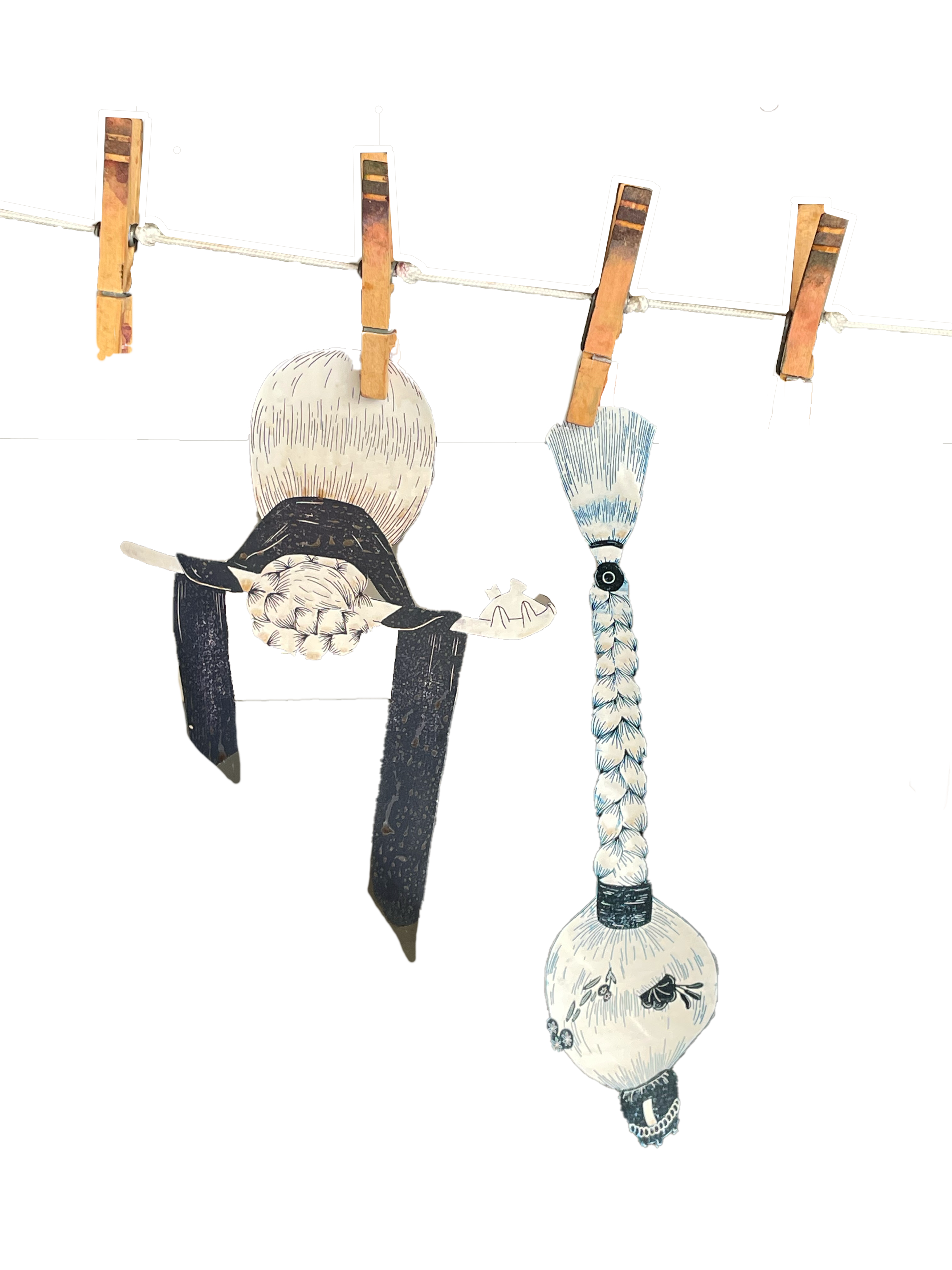
There are two layers to the production of the letter magnets. The first is the base of the letterform made out of lasercut white acrylic to mirror the crunchy, juicy light flesh of a Korean pear. The second is a tan felt fabric trace that resembles the peel of the pear unraveling from its flesh. I experimentation with the integration of the second layer by pleating, folding, and spiraling the material around the acrylic.