
Shaïr
NOV 2023 - FEB 2024 ︎ Brand Identity
[Skills] Visual Systems, Logo Design, Typography, Content Creation
[Tools] llustrator, Robofont
Derived from the Indonesian word “syair” meaning poem [and the Sanskrit word “syair” meaning “the Poet”], Shaïr is a fashion brand that, similarly to poetry, acts as a vessel for human emotion.
Shaïr also spells out the hybrid of the names of cofounders Natasha and Irma, who believe that poetry wields the power to connect the individual to their emotional self. They therefore reference this language to inform their fashion brand and tell both a classic and modern story of enchanting beauty and timeless love.
When creating poetic beauty, the relationship between the Poet and the Muse cannot go unnoticed. The Poet, Shaïr, is inspired by its Muse, a Shaïr’s girl. Shaïr creates for their Muses to spread love through fashion, so that a Shaïr’s girl may use their clothes to manifest their dream life and love themselves.
The four core values of Shaïr are nature, culture, handcraft, and expression, which lead to six main visual references: the moon orchid, Indonesian music, Indonesian tiles, wax stamps, fairytale stories, and poetry.
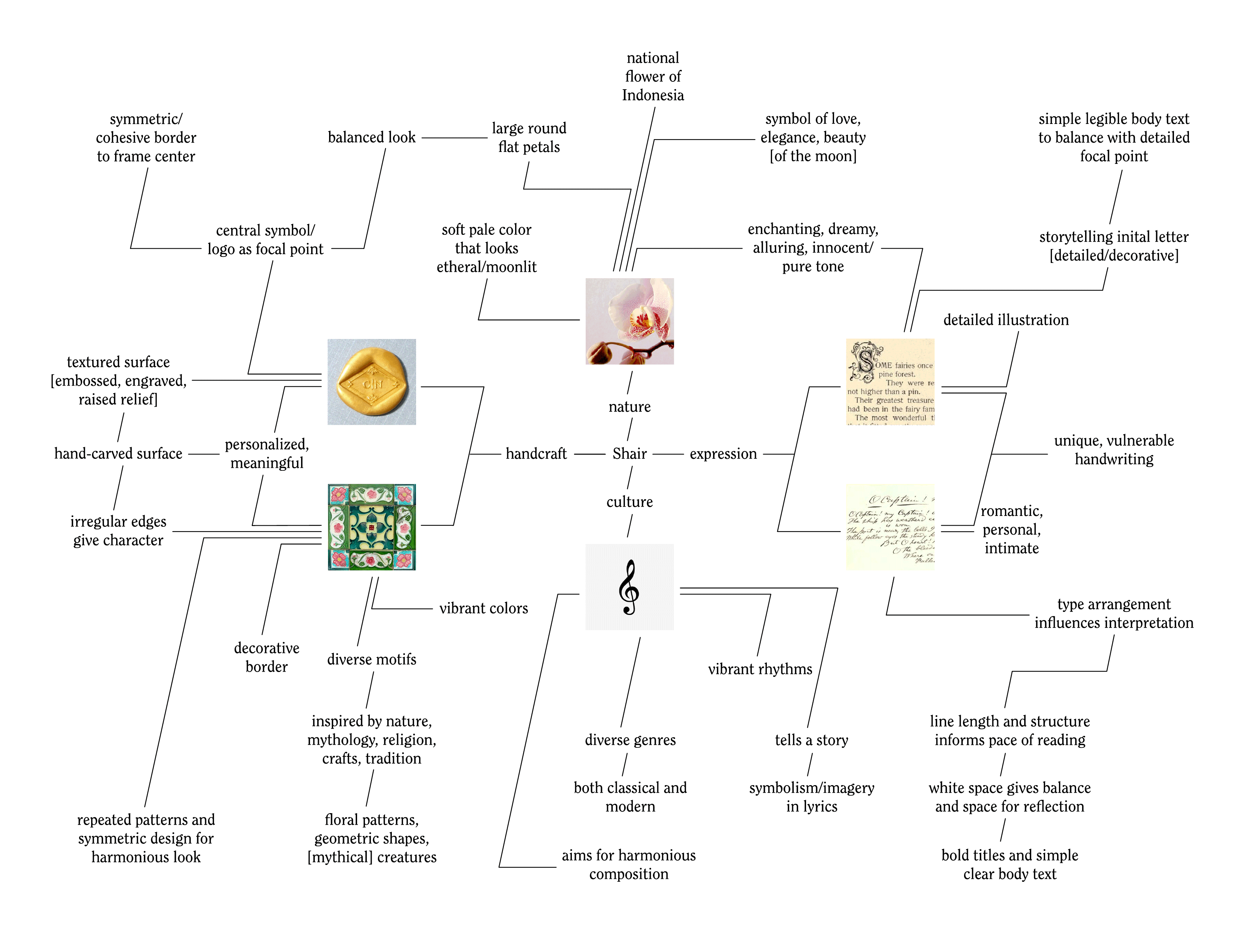
Mindmap Diagram exploring values and visual references of brand identity
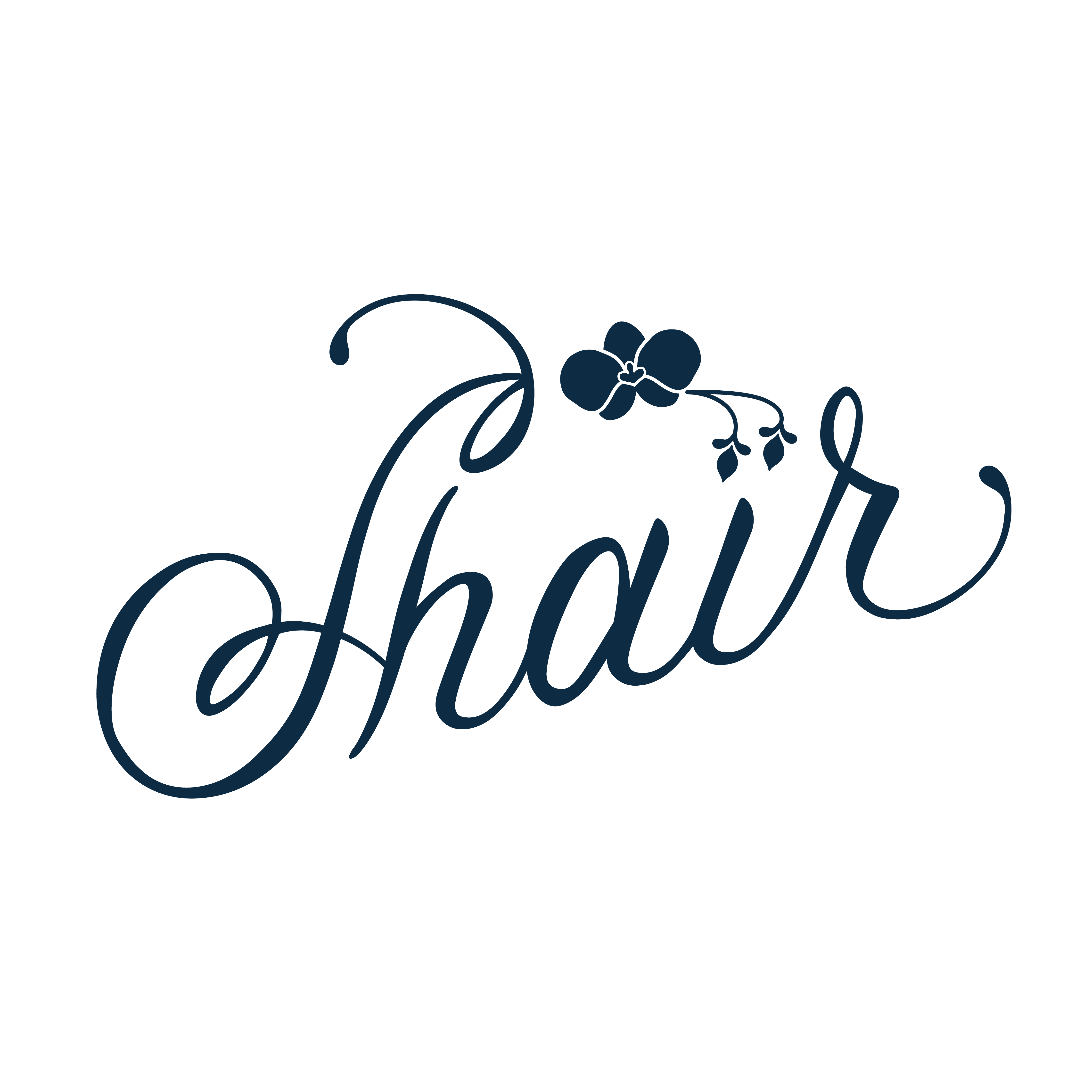
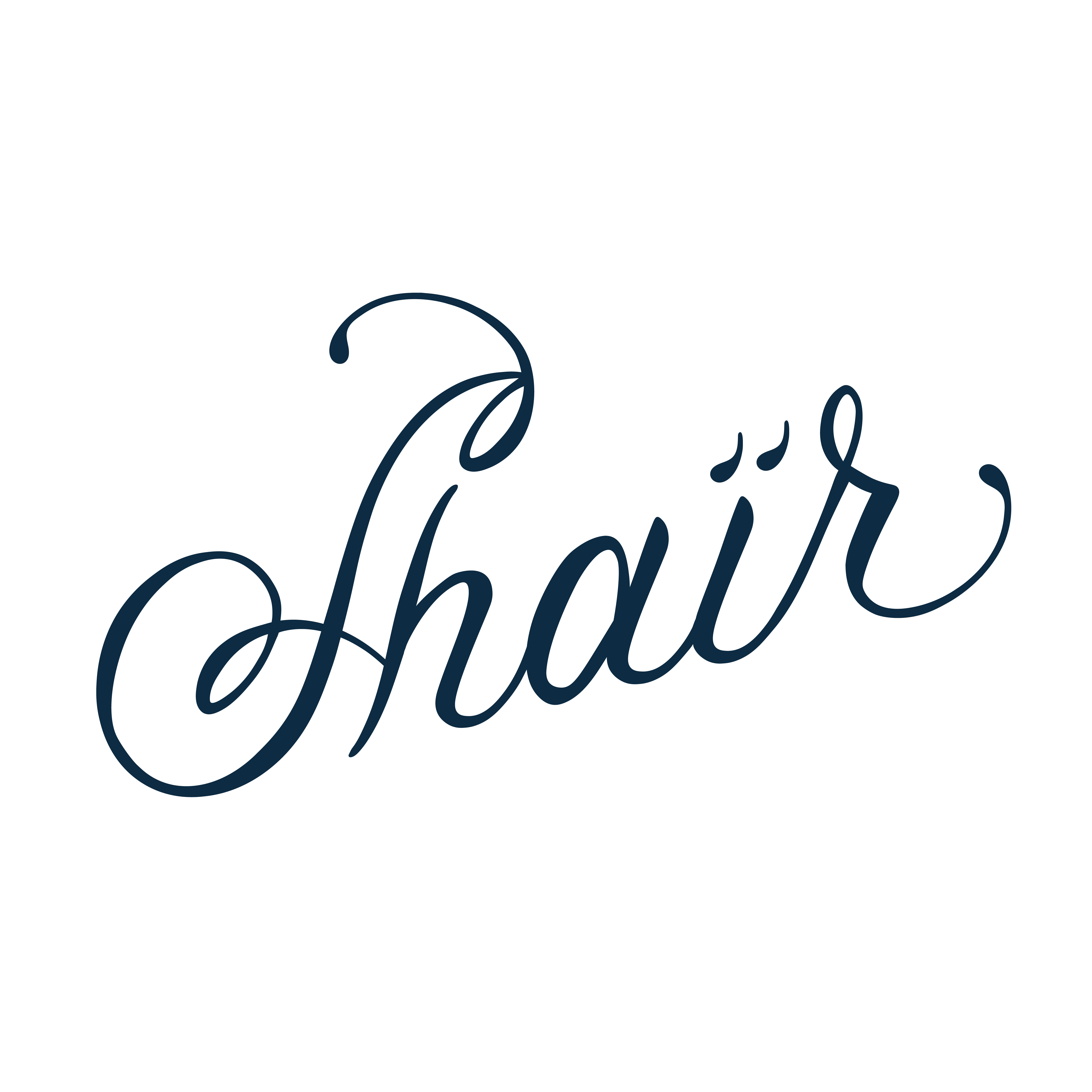
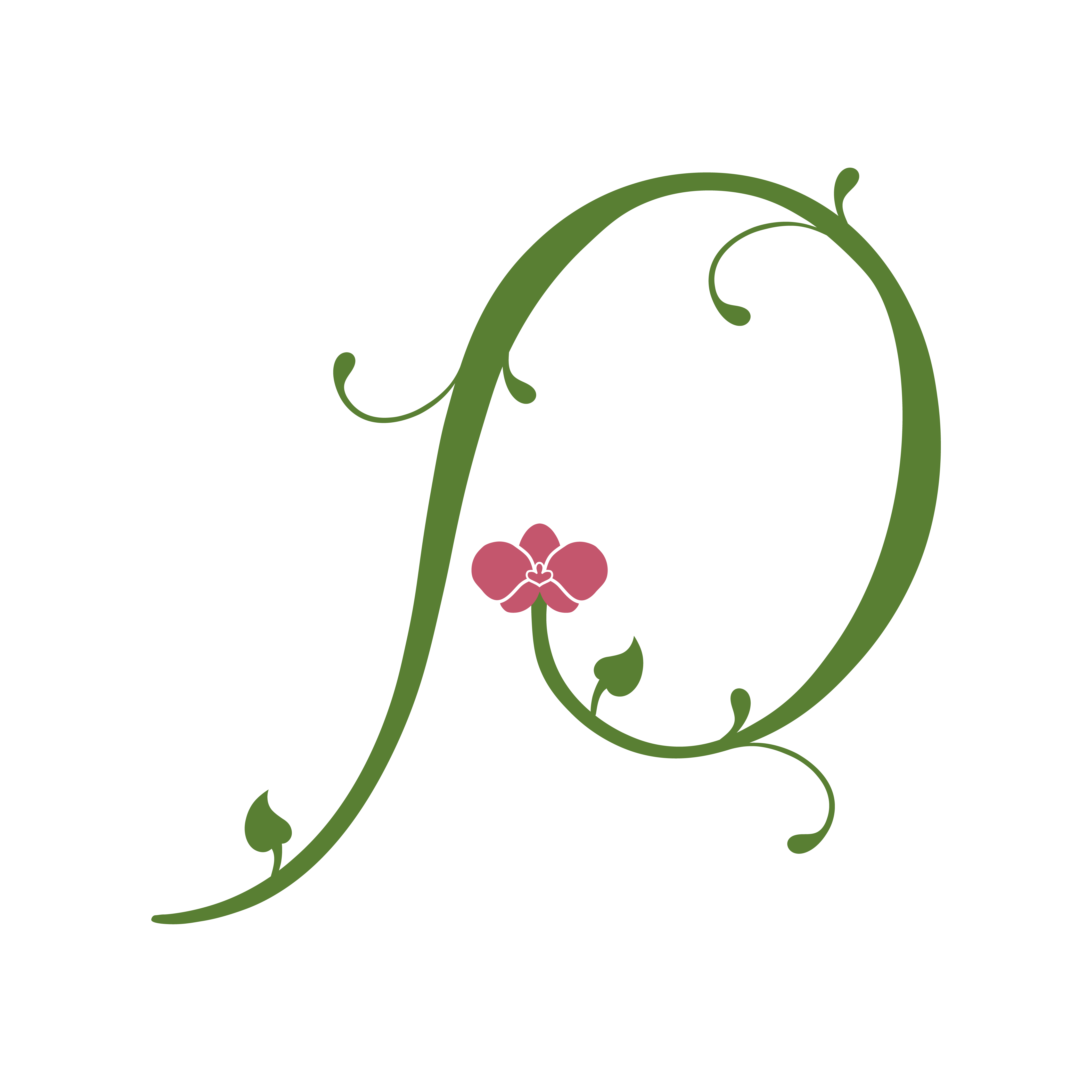
When sketching the logo, I wanted the focal point to land on the moon orchid and its connection to the letterforms of the brand name. The moon orchid is accompanied by two buds, which symbolize the diacritic dots over the “ï” in Shaïr. The letterforms are custom drawn to make the “S” resemble a treble cleft music note and the serifs acting as smaller buds or drifting flower stems. The arrangement of the primary logo is positioned in an upwards diagonal line in order to create more balance to the overall composition, imply a growing and hopeful tone, and mimic the classic diagonal text arrangement of vintage clothing tags. When the moon orchid is not as legible in smaller spaces, the secondary logo replaces the dicritic dots with similarly rounded serifs to match the rest of the letterforms.
Primary Logo Sketches
[Left] Primary Logo / [Right] Secondary Logo
The icon logo is intended to reference the complexity, geometric composition, and engraved texture of fairytale initials, Indonesian tiles, and wax stamps. The “S” of Shaïr is decorated in growing flower buds, leaves, and stems with the moon orchid residing in the middle. The central symbol is bordered by a cohesive diamond shape similar to the standard form of Indonesian tiles.
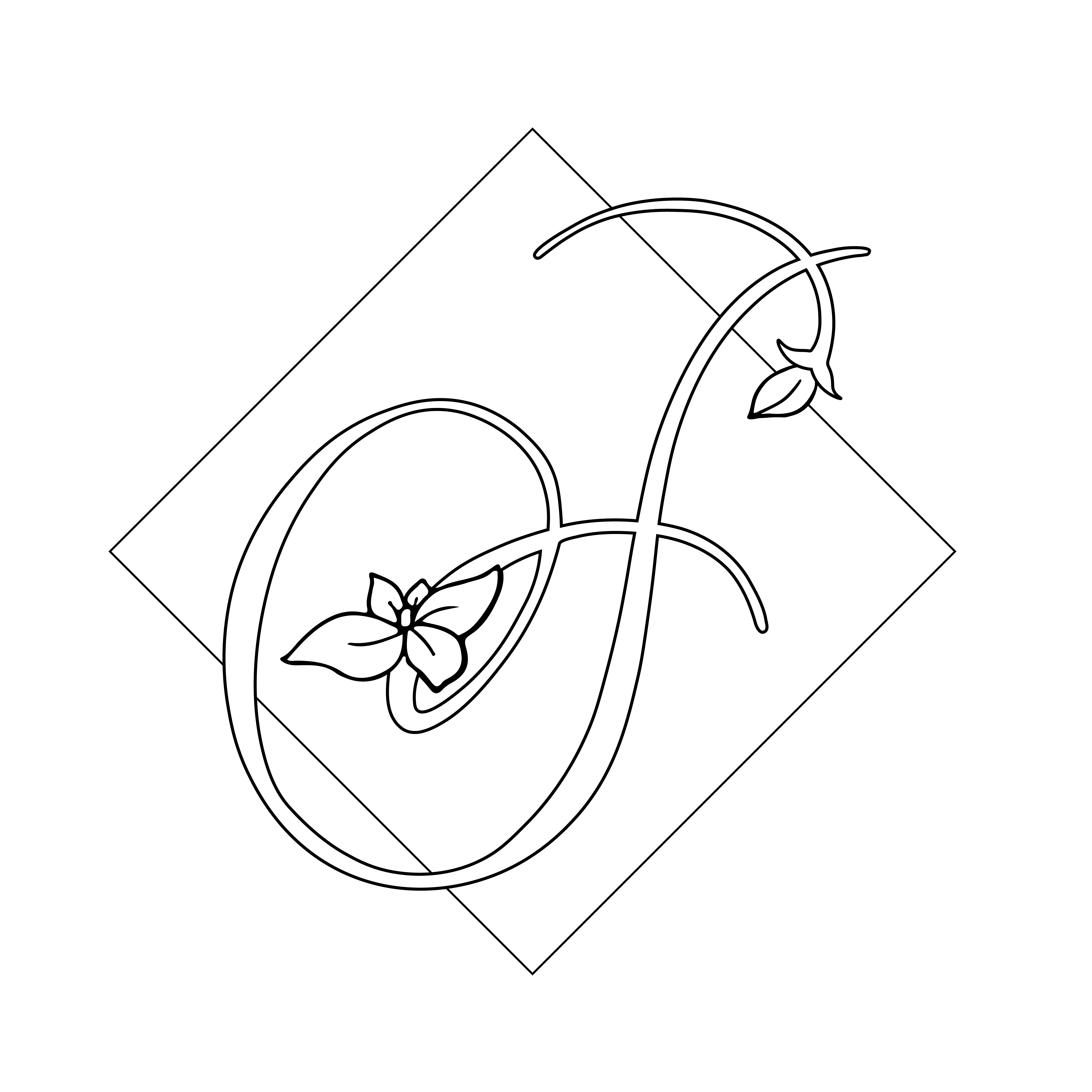
Icon Logo Sketches
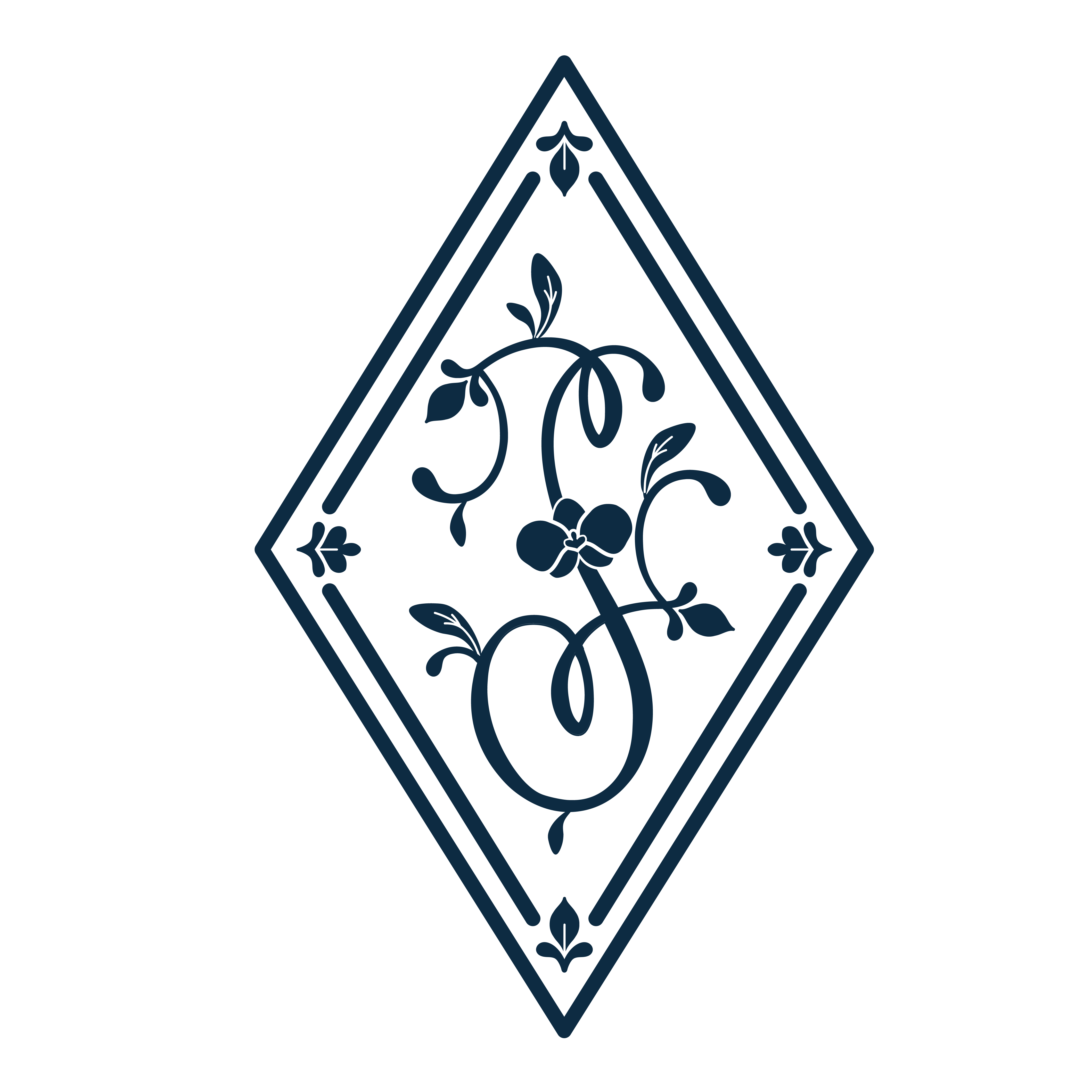

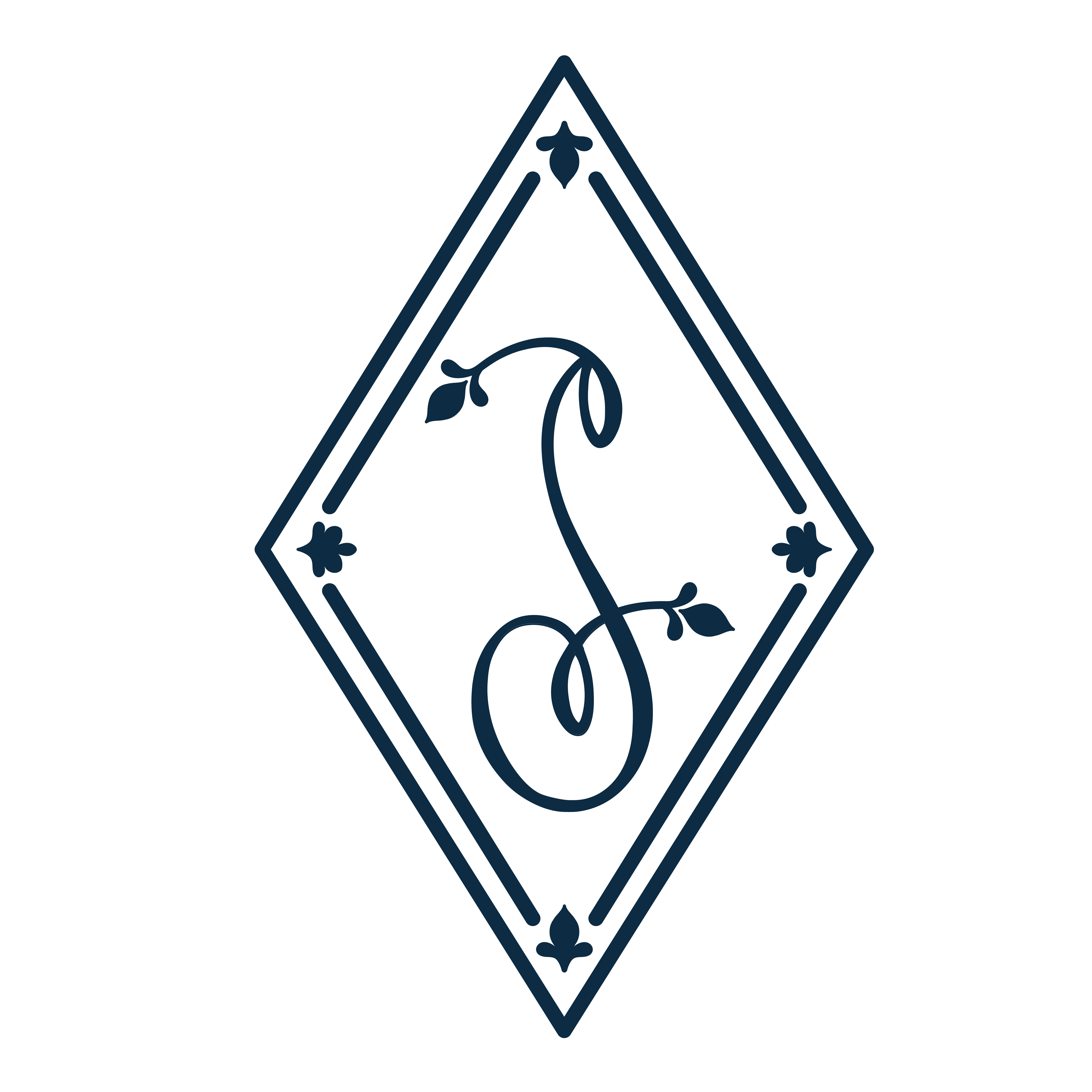
[Left] Primary Icon Logo / [Right] Secondary Icon Logo

Mockup of embossed Icon Logo
The color palette and graphic language heavily reinforces the charming tone and nature motifs introduced in the visual system. Each illustration has a balance of organic shapes arranged in a geometric composition, allowing any graphic to be appropriate for either a focal point or a supporting detail or border.

Mockup of Fabric Pattern Concepts


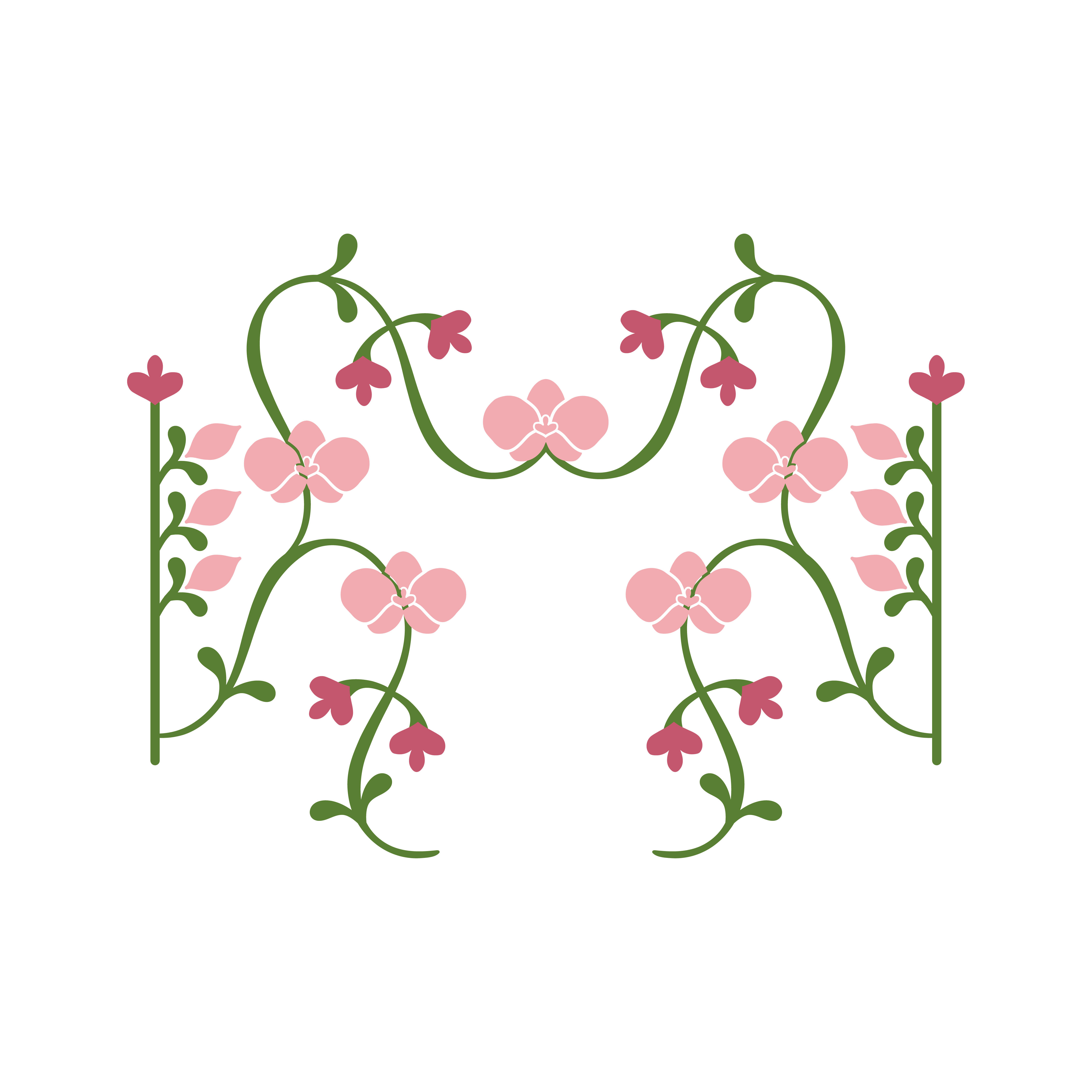

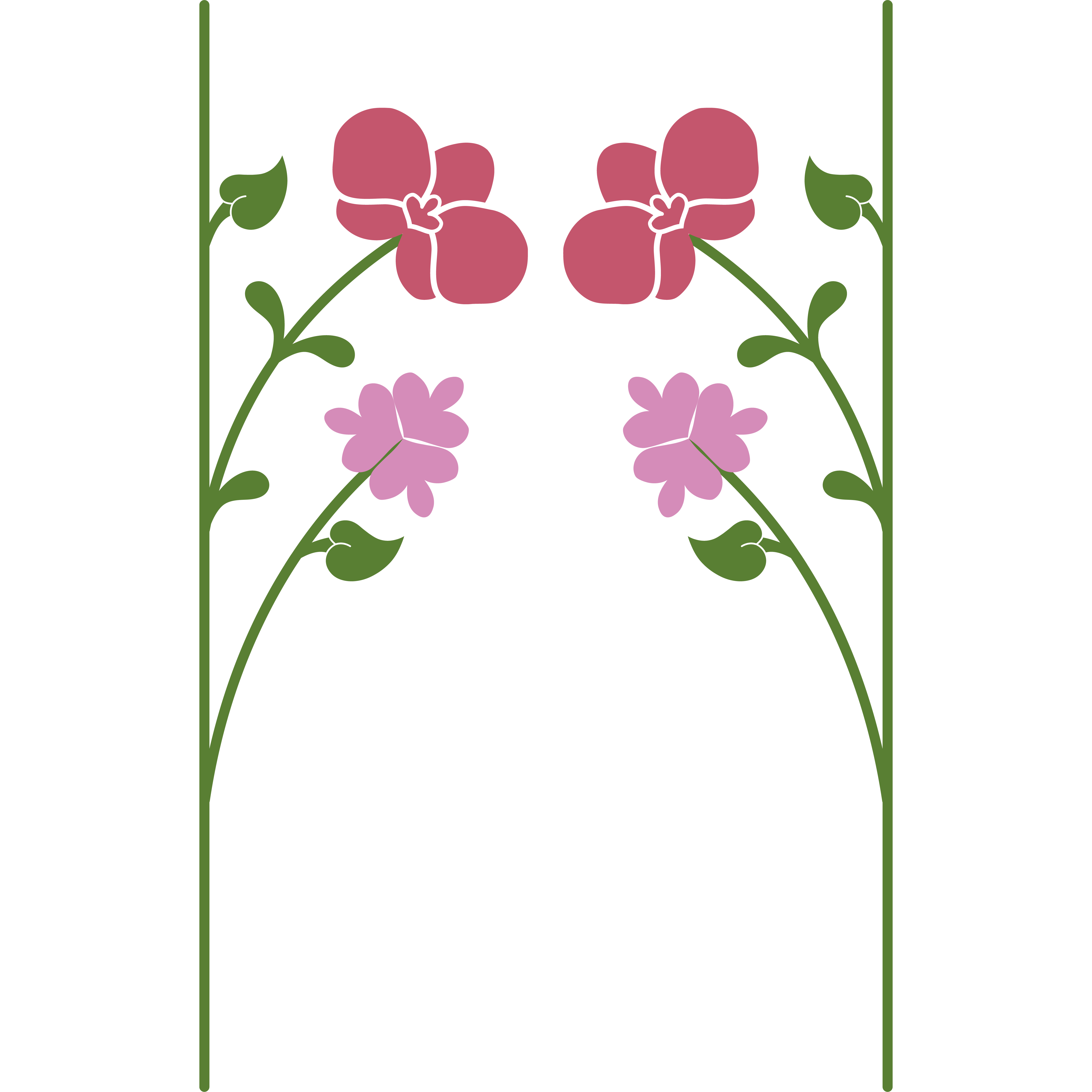

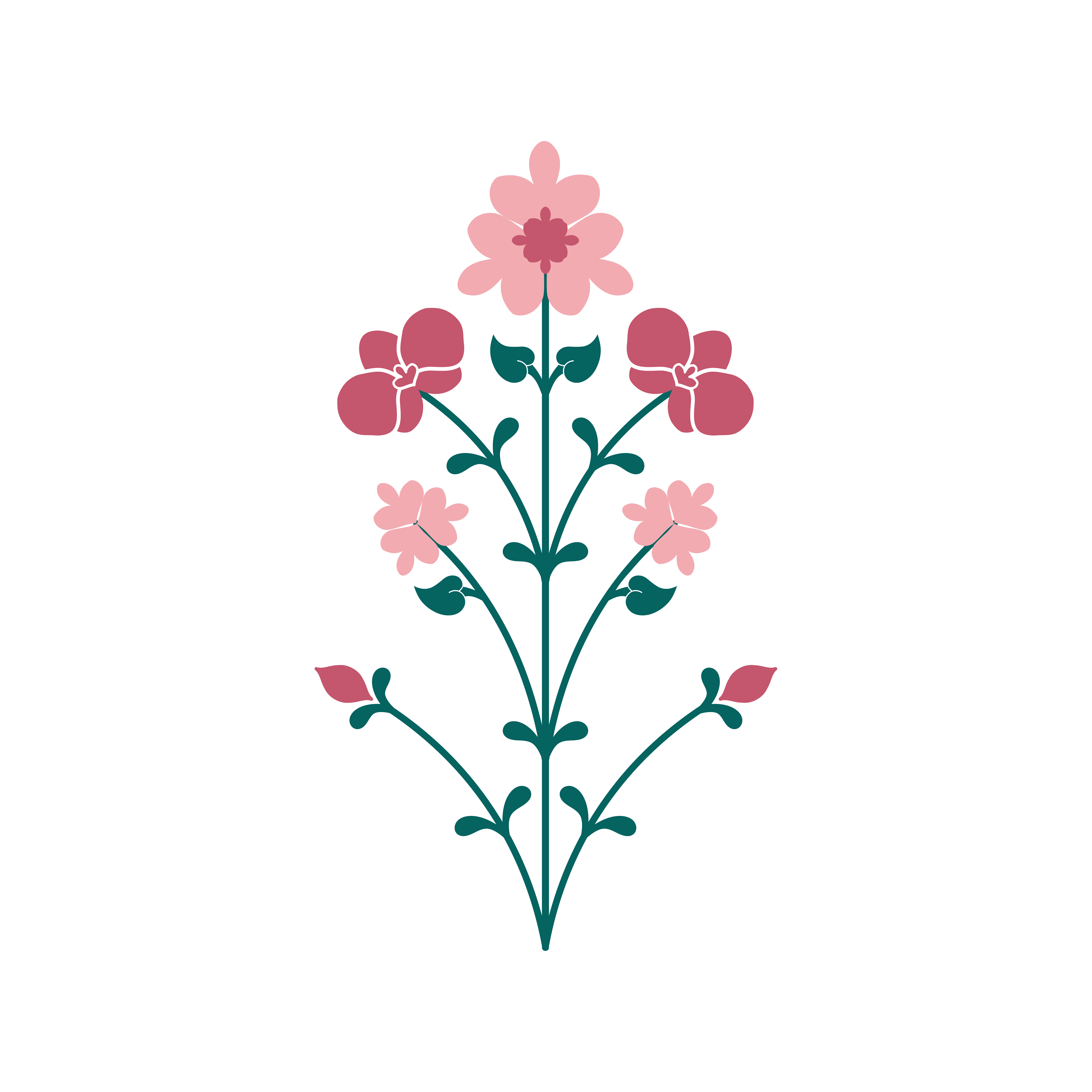

Set of Graphic Elements and Illustrations

Concept Design of product launches for aocial media launch
I am also currently working on a custom typeface inspired by rushed handwriting in a romantic poem or love letter. It is a mix of san serif and cursive letterforms to give both a classical and modern feel to the overall typeface.
Primary Typography
